
Real client work · India
Daiviq
Luxury fashion, designed slowly.
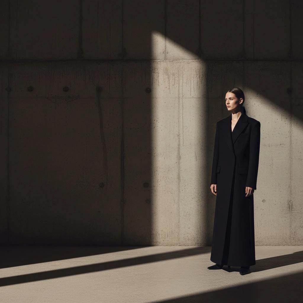
Remonthub designed and developed Daiviq’s fashion e-commerce website: a dark, architectural experience shaped for desktop and mobile.
- Client
- Daiviq
- Initiative
- Autumn/Winter e-commerce launch
- Market
- India · Online
- Scope
- Strategy · UX · UI · Responsive
Overview
Daiviq / Autumn–Winter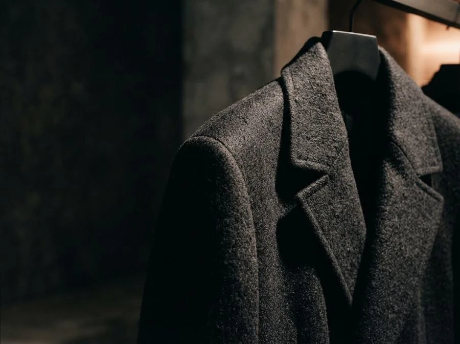
A store that
moves at the
label's pace.
Daiviq makes heavy, structured garments slowly. The website had to feel the same way.
The label was preparing its first online Autumn/Winter launch for the Indian market. Most fashion e-commerce relies on speed: banners, discounts and constant prompts. Daiviq needed the opposite, an interface that feels like walking through a quiet, dimly lit showroom.
We designed the full experience from strategy to responsive UI. A dark, architectural layout gives the garments room, the type stays thin and calm, and every decision serves one question: what helps a visitor feel the label, then find a piece they love?
- Goal
- Launch a premium Autumn/Winter store online
- Audience
- Design-aware buyers across India
- Role
- Strategy, UX, UI and responsive design
- Deliverable
- Desktop and mobile website design and development
The website design
Page Design
The opening of the store: campaign hero, philosophy strip, category tiles, editorial banners and a lookbook — all on a single dark canvas.


Category tiles
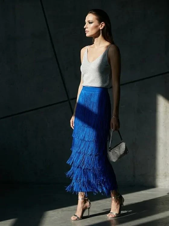
Women · Men · New In · Collections, each with piece count.
Editorial browsing
Editorial stories and product previews.
Challenge
Luxury online is usually loud. This label isn’t.
The tension
Slow, in a medium built for speed
Shoppers expect a fast path to cart, yet the brand is deliberately unhurried. The design had to feel slow without making buying harder.
Our answer
How we solved it
- Photography-led dark layout
- Quick view, size and cart in place
- Plain stock labels, no pressure
Process
From brand feeling to working store.
Phase 1
Discover
Understood the label, its materials and its pace.
- Brand walkthrough
- Audience definition
- Competitor scan
Phase 2
Define
Turned a feeling into clear design rules.
- Site map and pages
- Shopping flow
- Design principles
Phase 3
Design
Built the visual language and every key page.
- Palette and type
- Desktop and mobile UI
- Component library
Phase 4
Develop
Shipped a responsive store ready to launch.
- Front-end build
- Device testing
- Launch support
Experience
A hero that holds its breath.
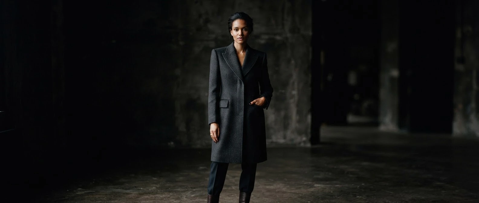
The opening behaves like a film still: one thin wordmark, one sentence and two levels of intent.
Atmosphere first
Dark photography sets the label's weight before any price appears.
Headline with two CTAs
The hero pairs a short editorial line with two buttons: one leads to the collection, one to the brand manifesto.
Wordmark as the hero
"DAIVIQ EDITION" sits large and centred above the copy, anchoring the page before any product is seen.
Design principle
The garment holds the frame.
The interface steps back.
User journey
From first scroll to first order.
Feel the brand
Film-like hero and philosophy set the tone.
HomeChoose the start
Four clear entry points with piece counts.
HomeBrowse the edit
Editorial banners frame each category.
CollectionQuick view
Price, colour and size without leaving the page.
Product cardAdd to cart
Select your size and add the piece to your cart.
Product pageBuy / Proceed
Review your cart and proceed to checkout.
Cart
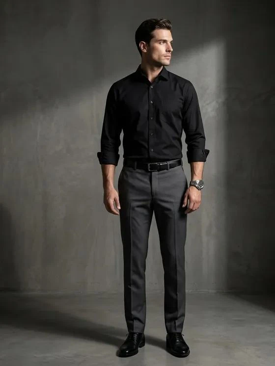
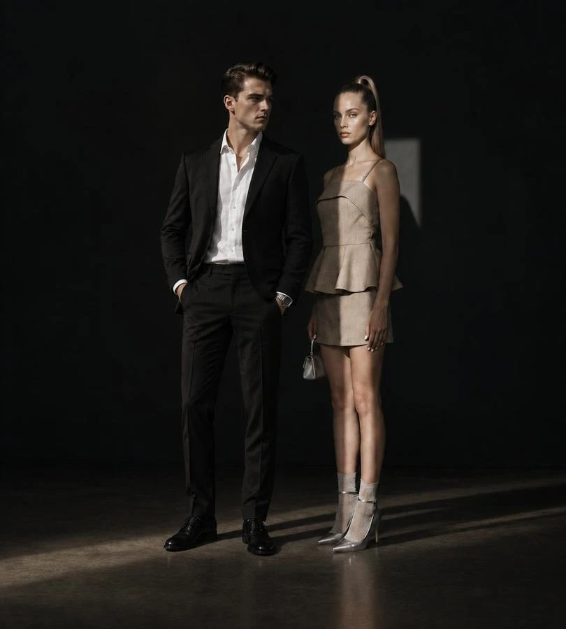
Categories
Women
24 pieces
Men
12 pieces
New in
8 pieces

Collections
3 edits
Key pages
Four pages, one coherent experience.
Home
Film-style hero, four entry points, editorial banners and a lookbook.
Product page
Gallery, size guide, quantity and a six-card details grid.
Account
Order timeline, reorder, addresses, wishlist and support.
About and Fund
Honest brand story and where a share of each order goes.
UX decisions
The choices that shaped the store.
Entry
Four entry points
Women, Men, New in and Collections, each with a piece count.
Counts set expectations and speed up orientation.
Cards
Quick view on every card
Colour, size and price appear in place, so browsing never breaks.
Fewer page loads from "I like it" to "add to bag".
Stock
Honest scarcity
"Only 2 left", "Sold out" and "Notify me" are plain labels, not pressure.
It matches how the label really works.
Detail
Scannable product details
Fabric, fit, shipping, returns, care and the Fund sit in six short cards.
Answers purchase doubts before they are asked.
Account
One calm account page
Order timeline, reorder, addresses, wishlist, profile and FAQs together.
Repeat buyers find everything without hunting.
Drops
Limited drops, shown calmly
The Late Autumn Drop is a slow carousel with one action per piece.
One clear action keeps the page quiet.
Visual system
Quiet enough to listen. Clear enough to buy.
Display · Outfit
DAIVIQ
Thin weights with wide tracking for headlines and the wordmark.
Body · Geist
slow rhythm
Neutral and legible for product details, forms and order data.
- Obsidian
#0A0807 - Dark Brown
#1A1210 - Mahogany
#541B18 - Copper
#B98A5E - Linen
#ECE5D9
Dark by default
Obsidian and brown frame the garments like a showroom wall.
Copper for action
Only buttons, links and key labels, so the eye knows where to go.
Linen where detail matters
A light surface on product pages for accurate colour and fabric.
Responsive design
Desktop first. Then Mobile.
Built desktop-first, then adapted to mobile — the homepage, editorial pages and collections retain their atmosphere at every breakpoint.


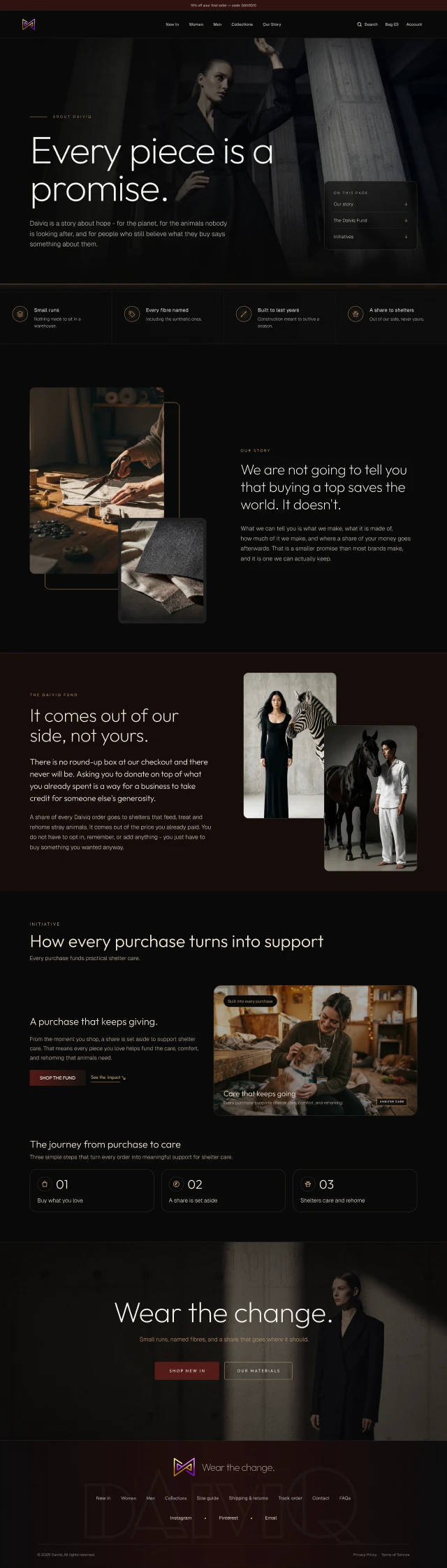
The Daiviq Fund
It comes out of our side, not yours.
There is no round-up box at our checkout and there never will be. Asking you to donate on top of what you already spent is a way for a business to take credit for someone else's generosity.
A share of every Daiviq order goes to shelters that feed, treat and rehome stray animals. It comes out of the price you already paid. You do not have to opt in, remember, or add anything — you just have to buy something you wanted anyway.
What the design enables
One label. One coherent experience.
Intended benefits of the design, not claimed performance results.
Faster orientation
Four entry points from the first scroll.
Premium perception
Restraint and weight signal craft.
Calm conversion
Quick view and scarcity without noise.
Responsive continuity
The same promise at every width.
Takeaways
Luxury isn’t louder. It’s the space you leave around the product.
Dark needs contrast discipline
Thin type on dark only works with careful sizing and contrast checks.
Copy is part of the design
Plain, honest words about stock, shipping and the Fund carried as much brand as the visuals.
Restraint is a feature
Every banner and prompt we removed made the rest feel more valuable.
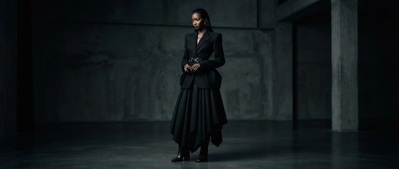
Have a brand that moves slowly?
Let's make it feel inevitable.
Tell us about your label, your audience and the pace you want to keep.
We'll design the website around it.