Arogyan
Logo Design

The Arogyan logo reflects a strong connection to nature, wellness, and traditional knowledge. The organic forms and earthy color palette evoke freshness, growth, and trust, reinforcing the brand’s focus on natural and holistic well-being. The visual elements feel grounded and approachable, symbolizing balance between health, sustainability, and authenticity. Overall, the logo communicates care, purity, and reliability, positioning Arogyan as a brand rooted in natural goodness and mindful living.
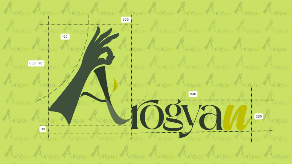
Arogyan: Green cooking-oil wordmark with a hand-shaped A and spacing guides
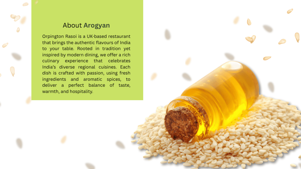
Arogyan: Brand introduction beside a bottle of oil and seeds
Arogyan: Brand vision beside a family photograph and golden oil splash
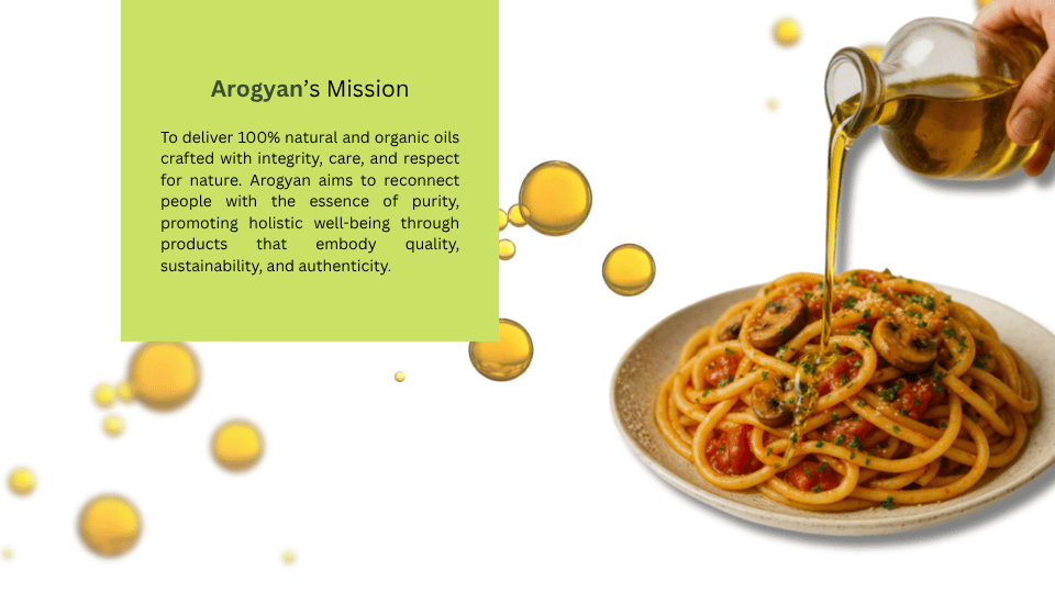
Arogyan: Brand mission beside cooking oil and a prepared meal
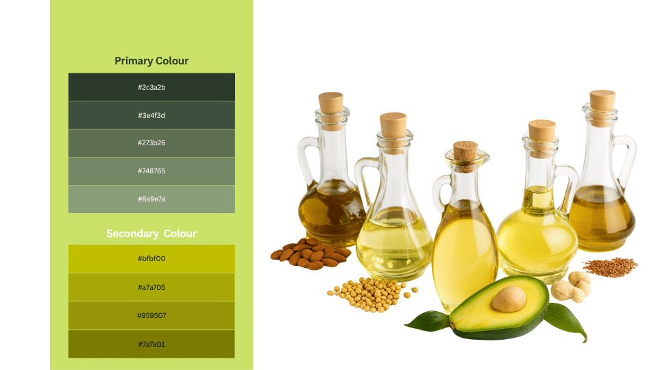
Arogyan: Green and yellow colour palette beside assorted oil bottles
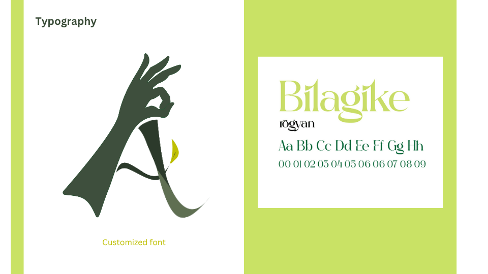
Arogyan: Serif typography specimens and the hand-shaped A symbol
Arogyan: Green wordmark with a yellow accent on a white background
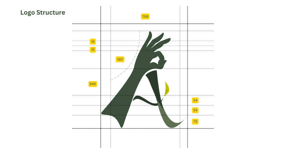
Arogyan: Construction grid for the hand-shaped A symbol
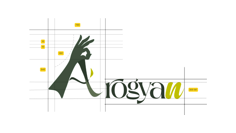
Arogyan: Complete wordmark spacing and alignment guides
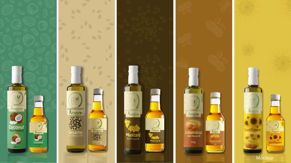
Arogyan: Cooking-oil bottle mockups against five coloured backgrounds