JDS Enterprises
Logo Design

We Connected A Few Dots.

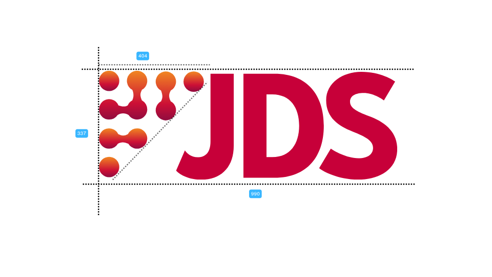
JDS sources semiconductors, sensors and other electronic components. We gave the logo a detail that nods to what those parts help build.

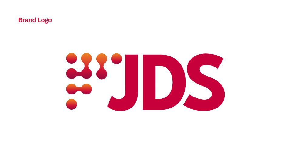
Next to the bold JDS lettering, we arranged orange and red dots in a triangle. Some join up like contacts on a circuit board. It’s a small detail that gives the three letters a signature of their own.

We mocked it up on a social banner and in a small profile picture. The idea was to give customers a mark they could pick out at a glance, even when all it gets is a little circle.

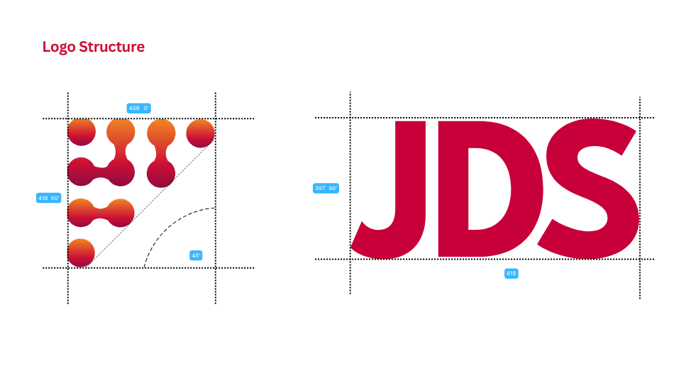
JDS: Magenta wordmark and orange circuit-like dots with spacing measurements
JDS: Brand introduction beside an illuminated processor illustration
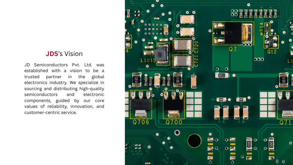
JDS: Brand vision beside a green circuit board
JDS: Brand mission beside an electronic components close-up
JDS: Magenta and orange palette over an electronics workbench photograph
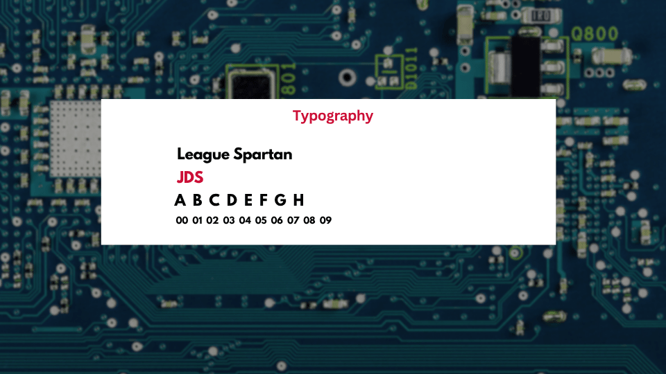
JDS: League Spartan typography specimens over a circuit board
JDS: Magenta wordmark with an orange and red connected-dot symbol
JDS: Construction measurements for the circuit symbol and lettering
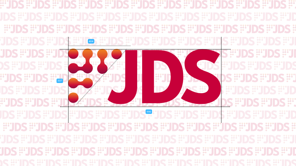
JDS: Complete logo proportions and alignment guides
JDS: Logo applied to a web profile and circular avatar mockup