SnackLuxe Branding

Homemade heart. Branding with bite.

SnackLuxe’s story begins with a mother’s love and the comfort of homemade treats. We brought that warmth into a brand identity with a little playfulness and plenty of character.

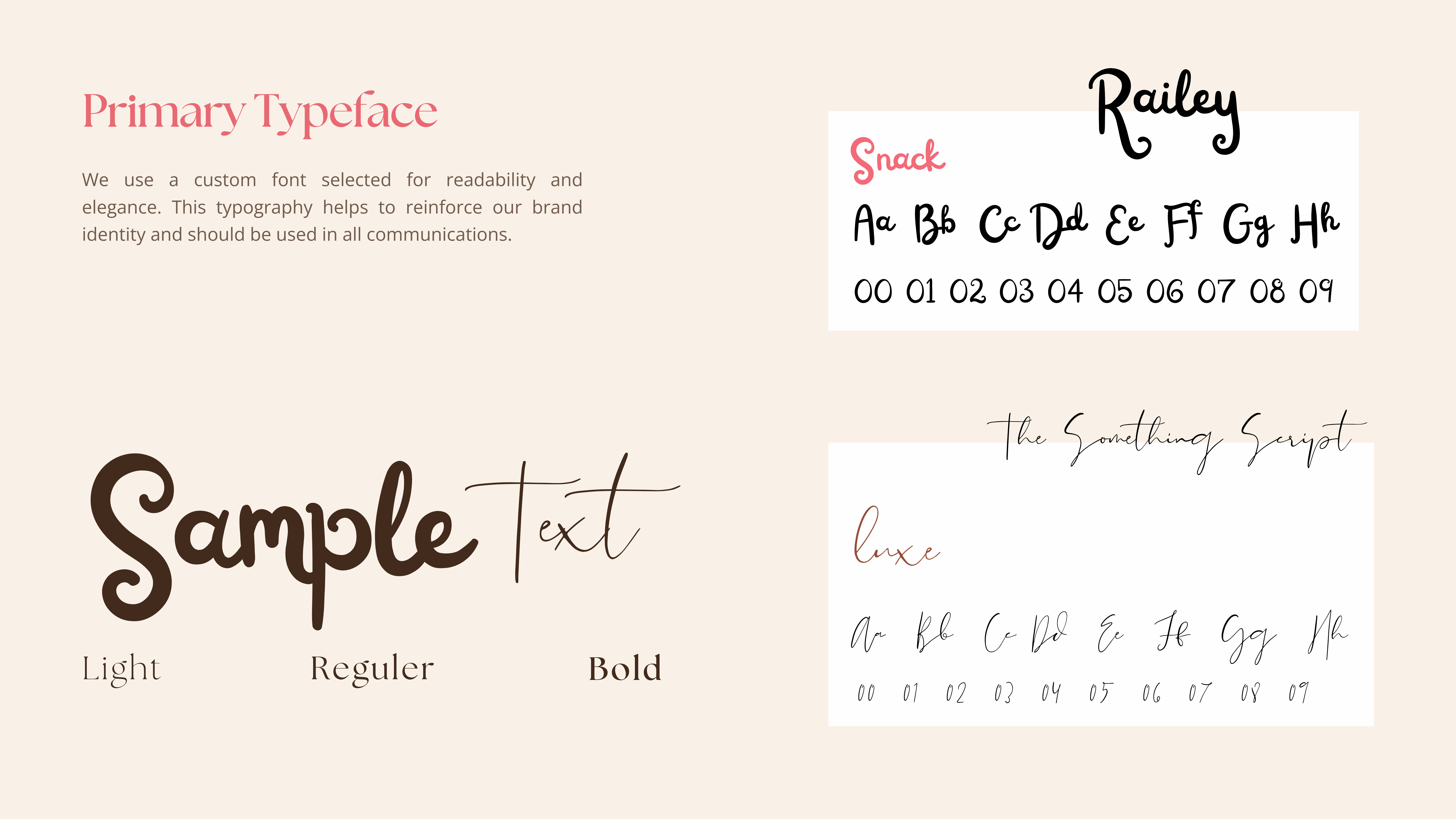
Expressive script lettering, creamy neutrals, cocoa brown and a pop of pink bring the look together. Ingredient illustrations and flavour-specific packaging give each cookie its own personality, while keeping the whole range unmistakably SnackLuxe.

The project brings together logo variations, typography, colour guidelines, packaging, labels and promotional artwork—all supported by a friendly, reassuring brand voice.

Good looks with a clear purpose: a consistent identity that carries the same homemade heart across every pack and brand touchpoint.
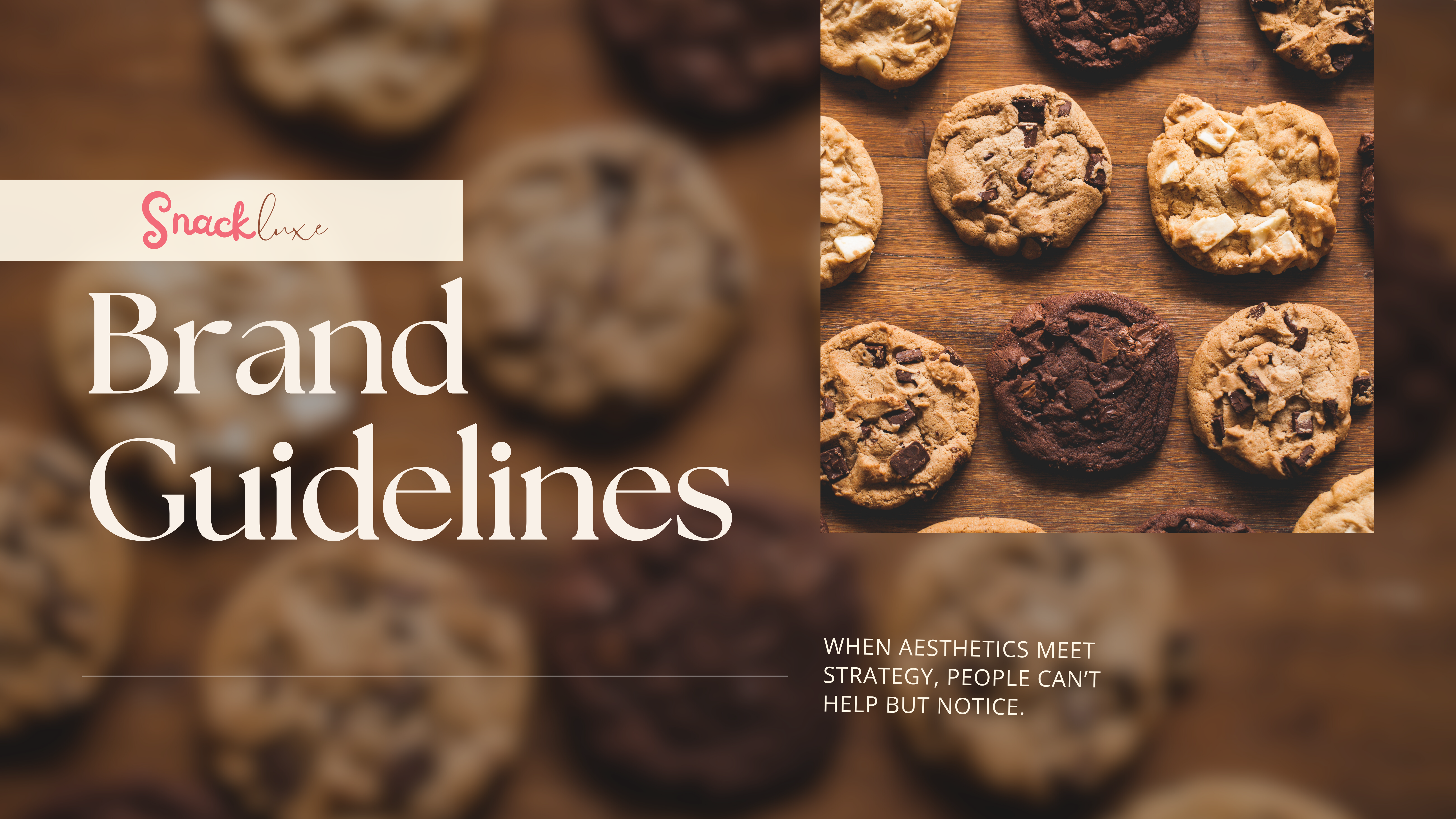
SnackLuxe branding: Brand guidelines cover with cookie photography
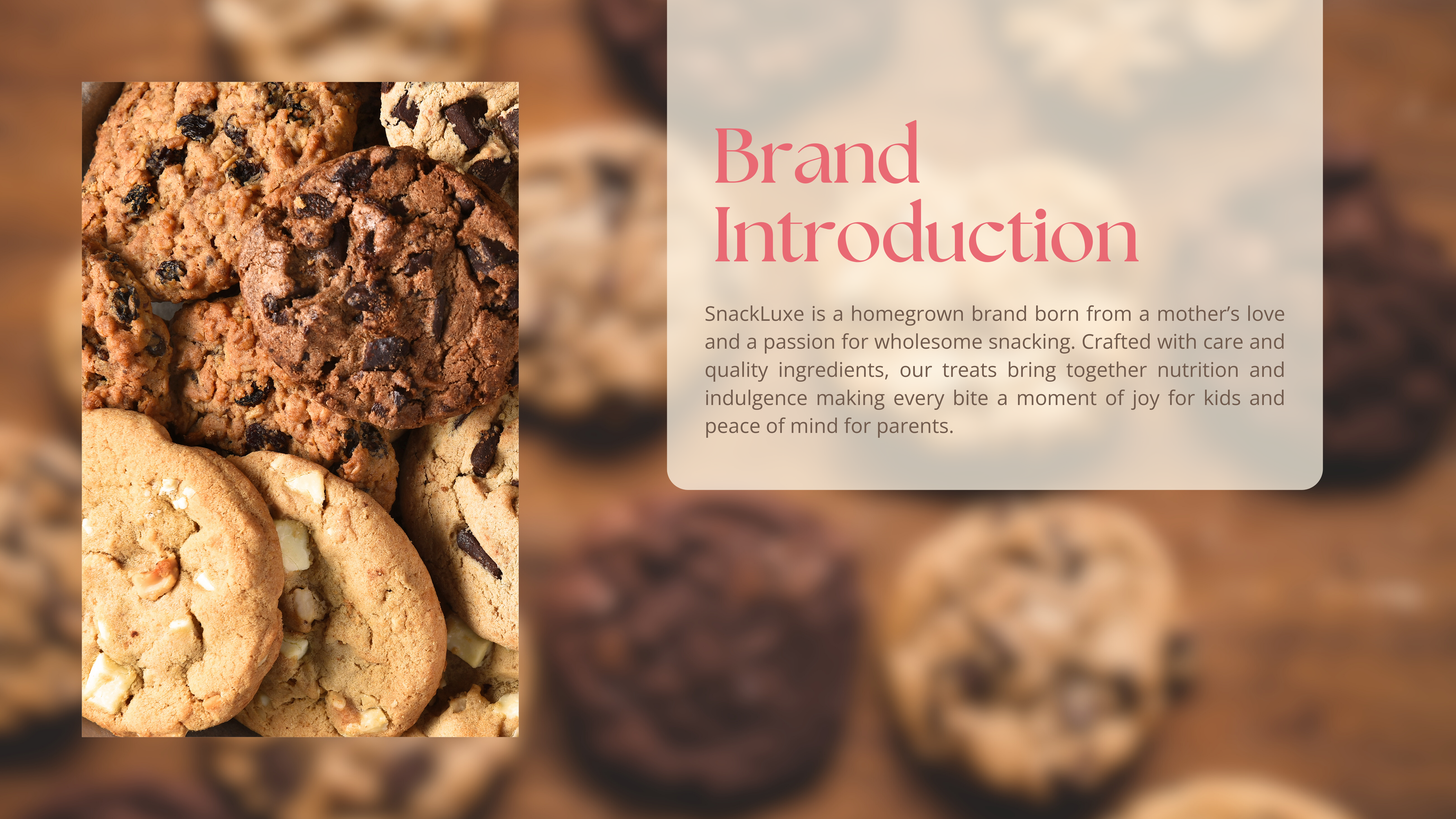
SnackLuxe branding: Brand introduction over close-up cookie photography
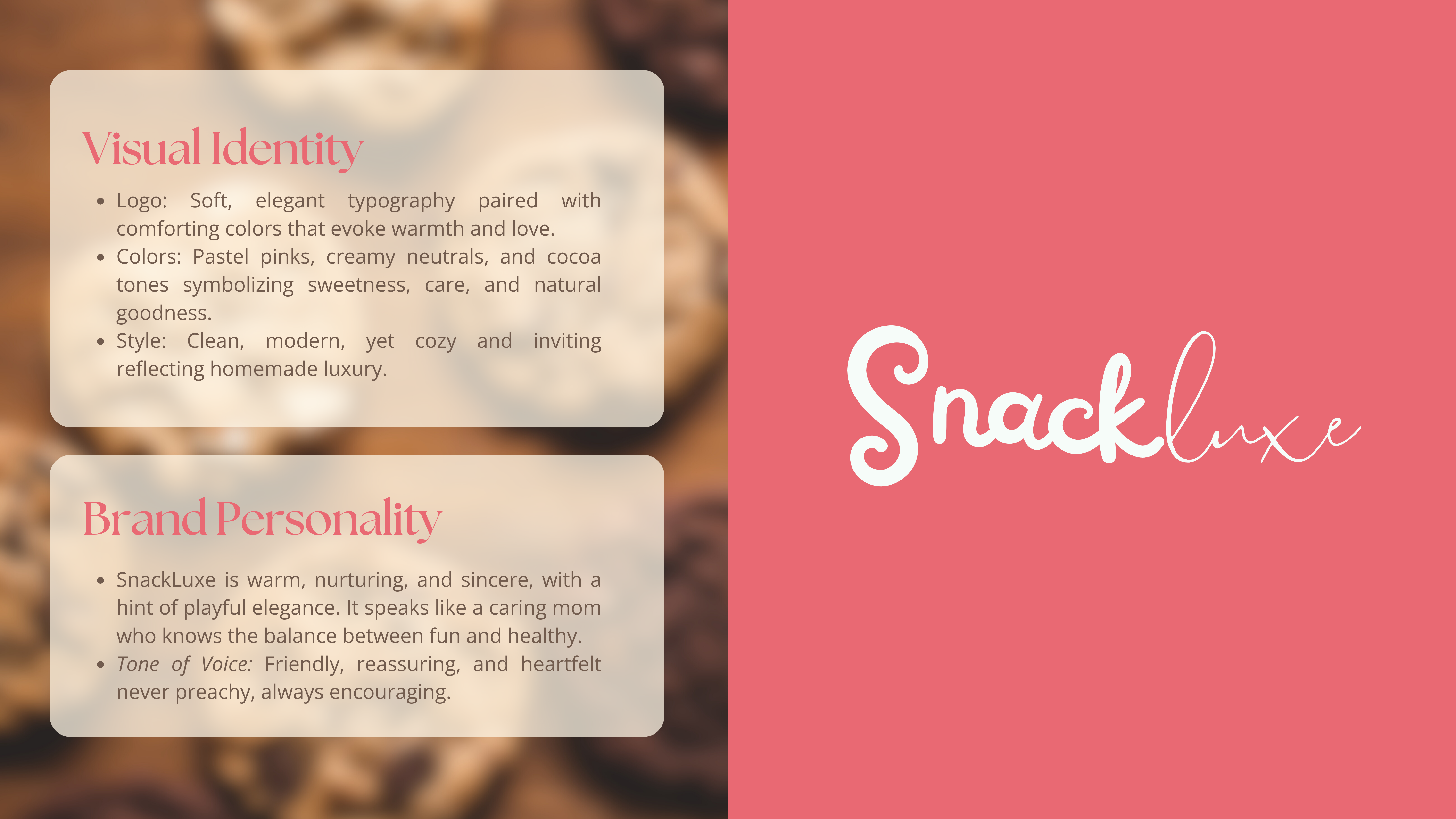
SnackLuxe branding: Visual identity and brand personality with a white script wordmark
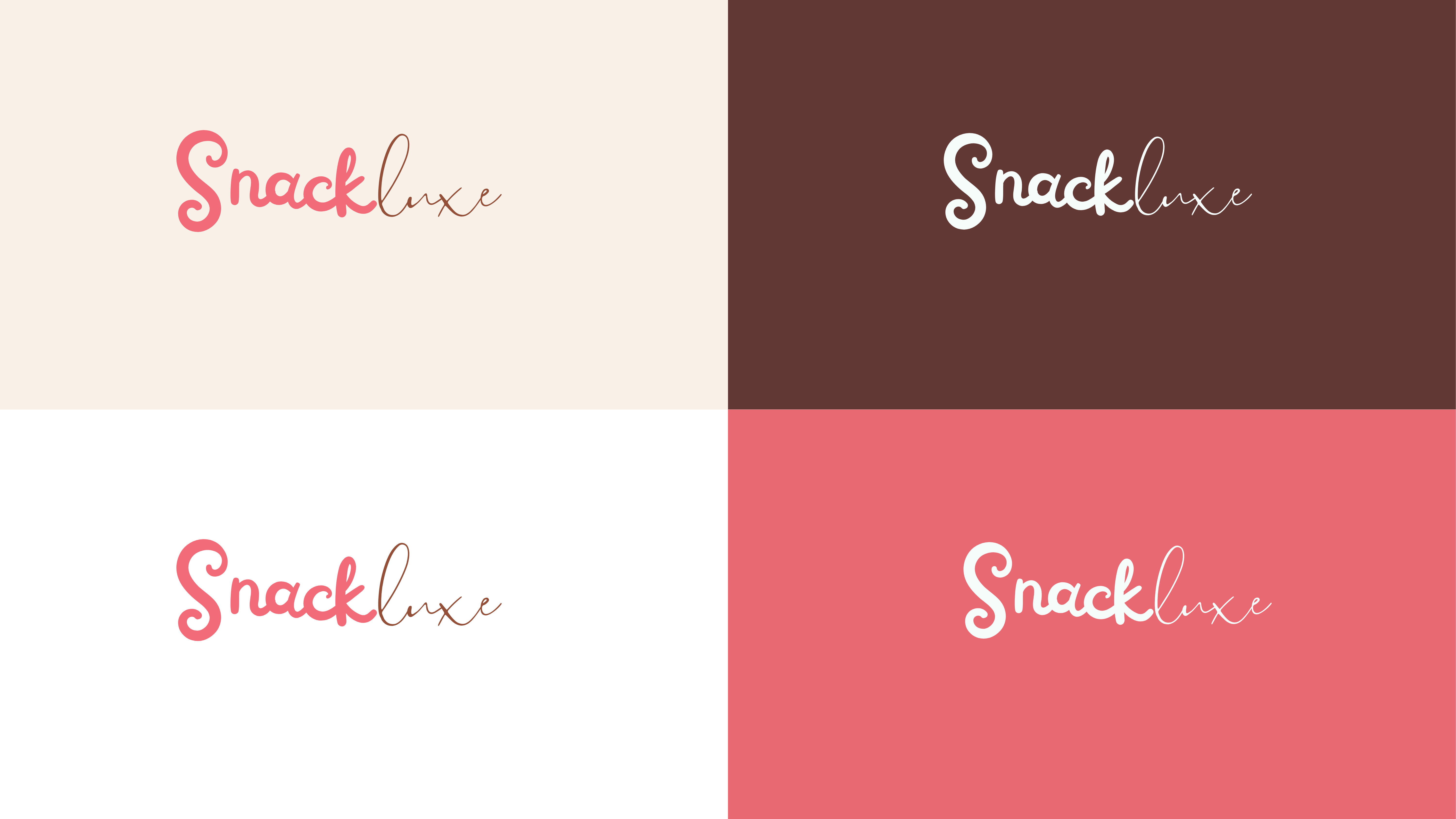
SnackLuxe branding: Logo colour variations on cream, brown, white and pink backgrounds
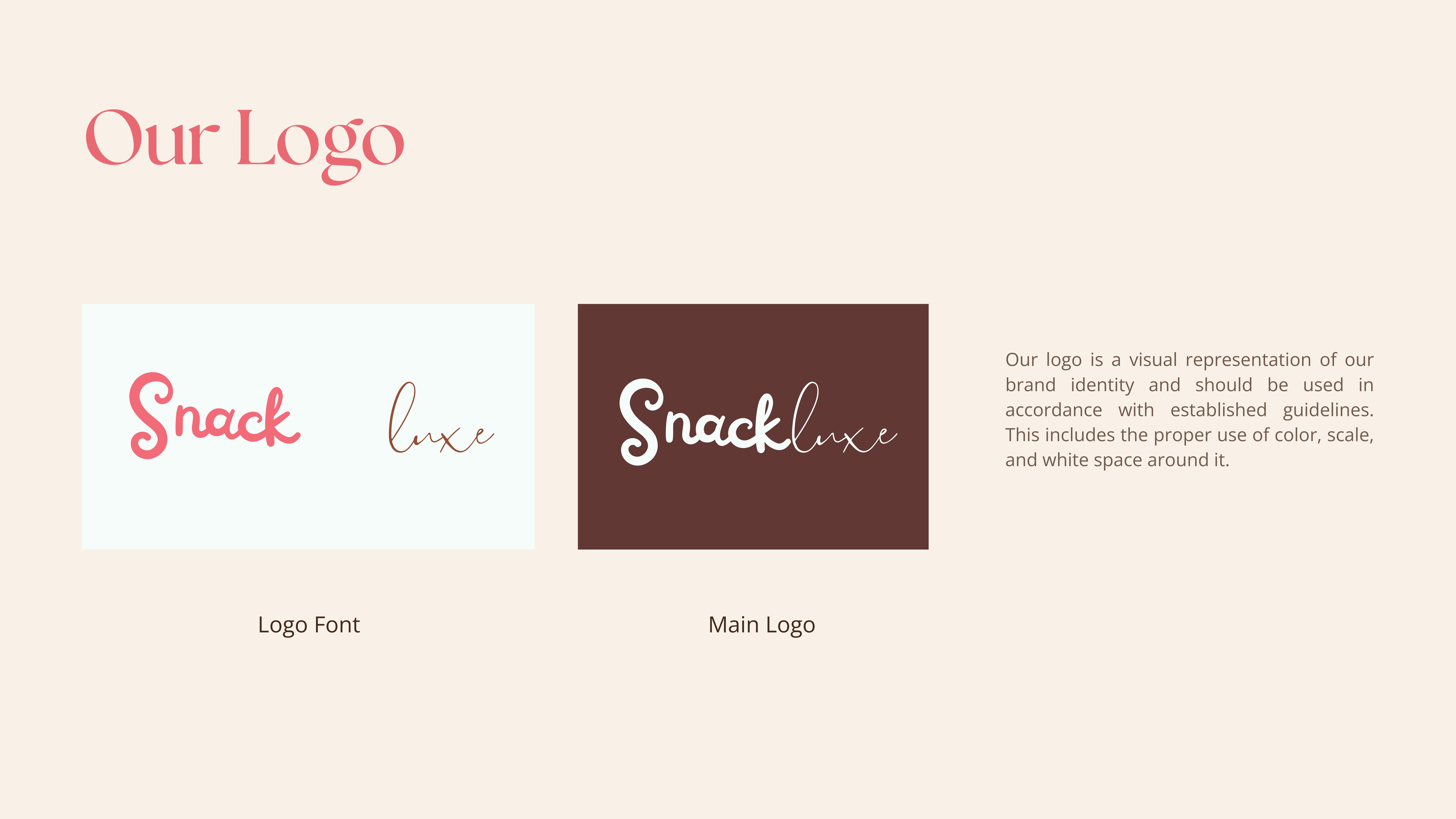
SnackLuxe branding: Separate script lettering elements and the complete logo
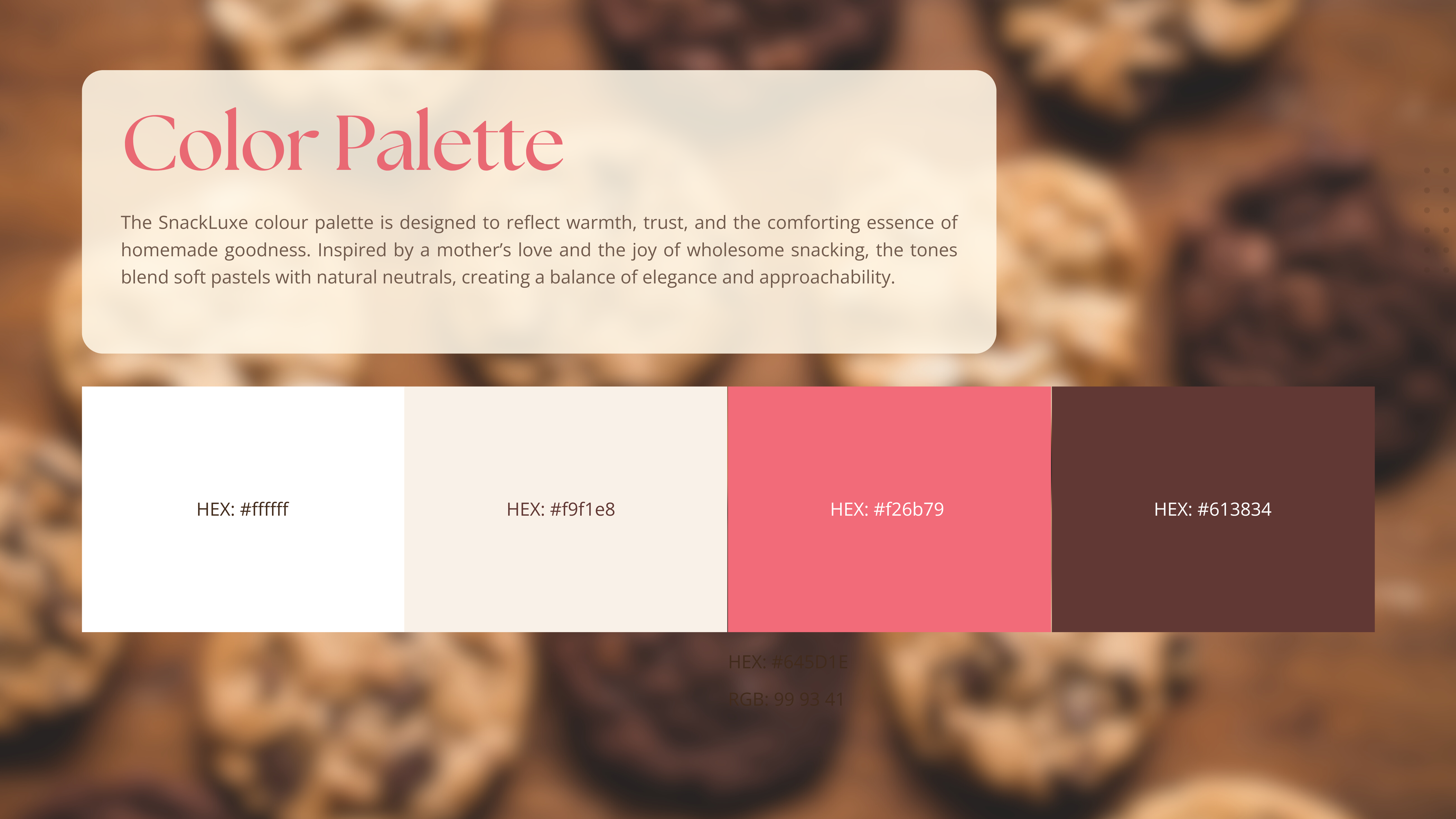
SnackLuxe branding: Cream, pink and brown brand colour palette
SnackLuxe branding: Primary script typefaces and sample lettering
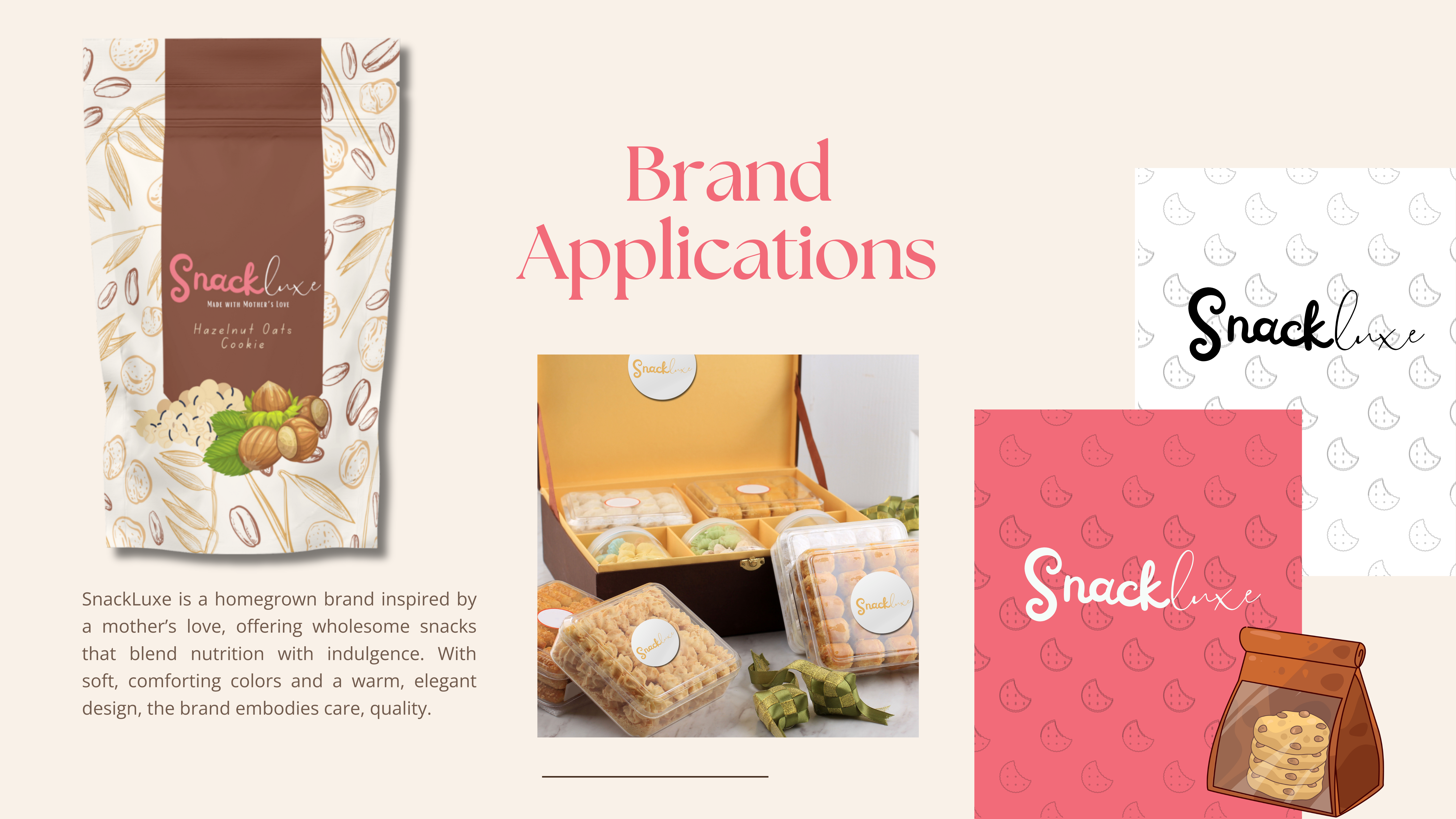
SnackLuxe branding: Brand applications on cookie packaging and printed materials
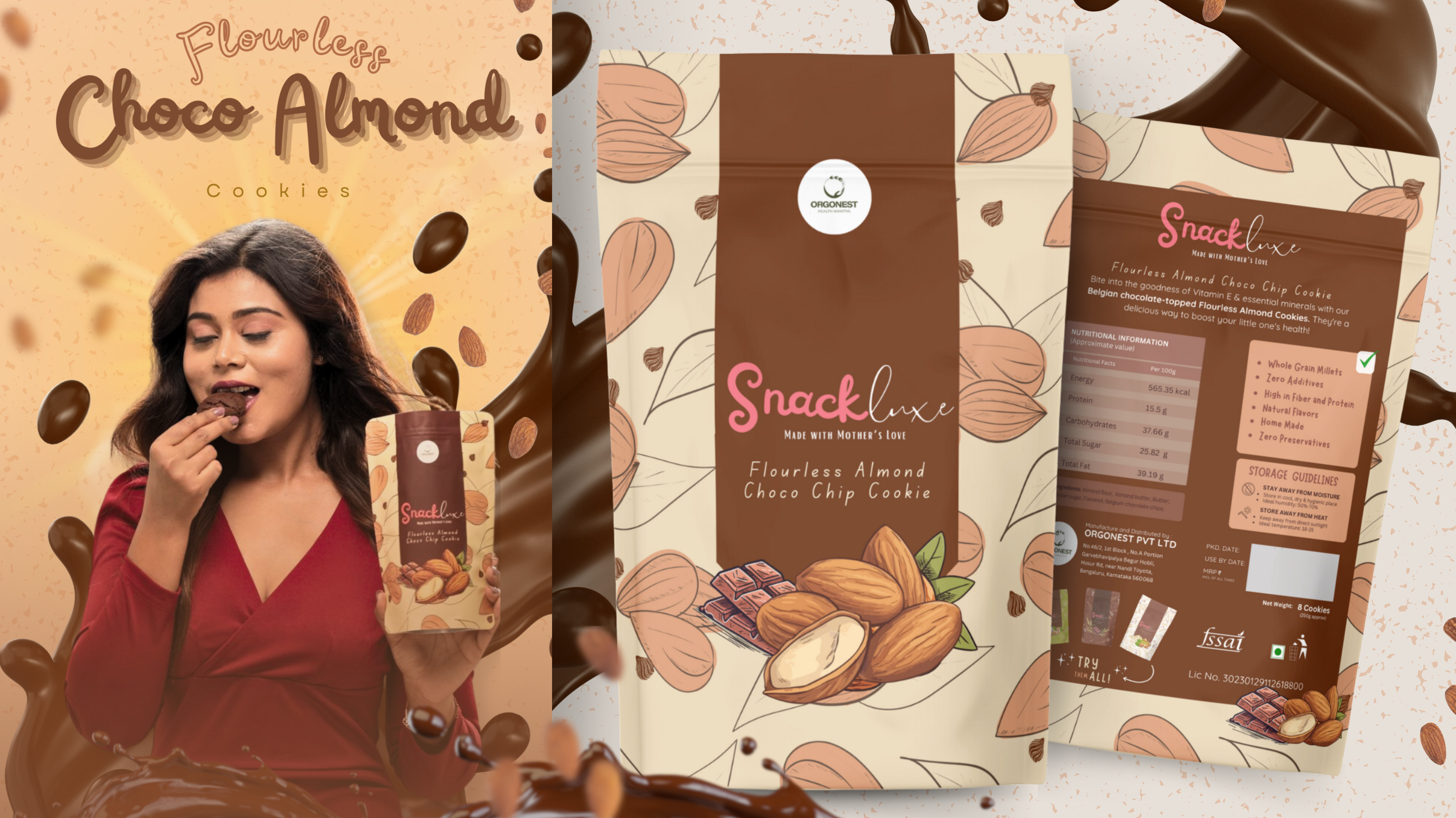
SnackLuxe branding: Choco Almond cookie packaging and campaign artwork
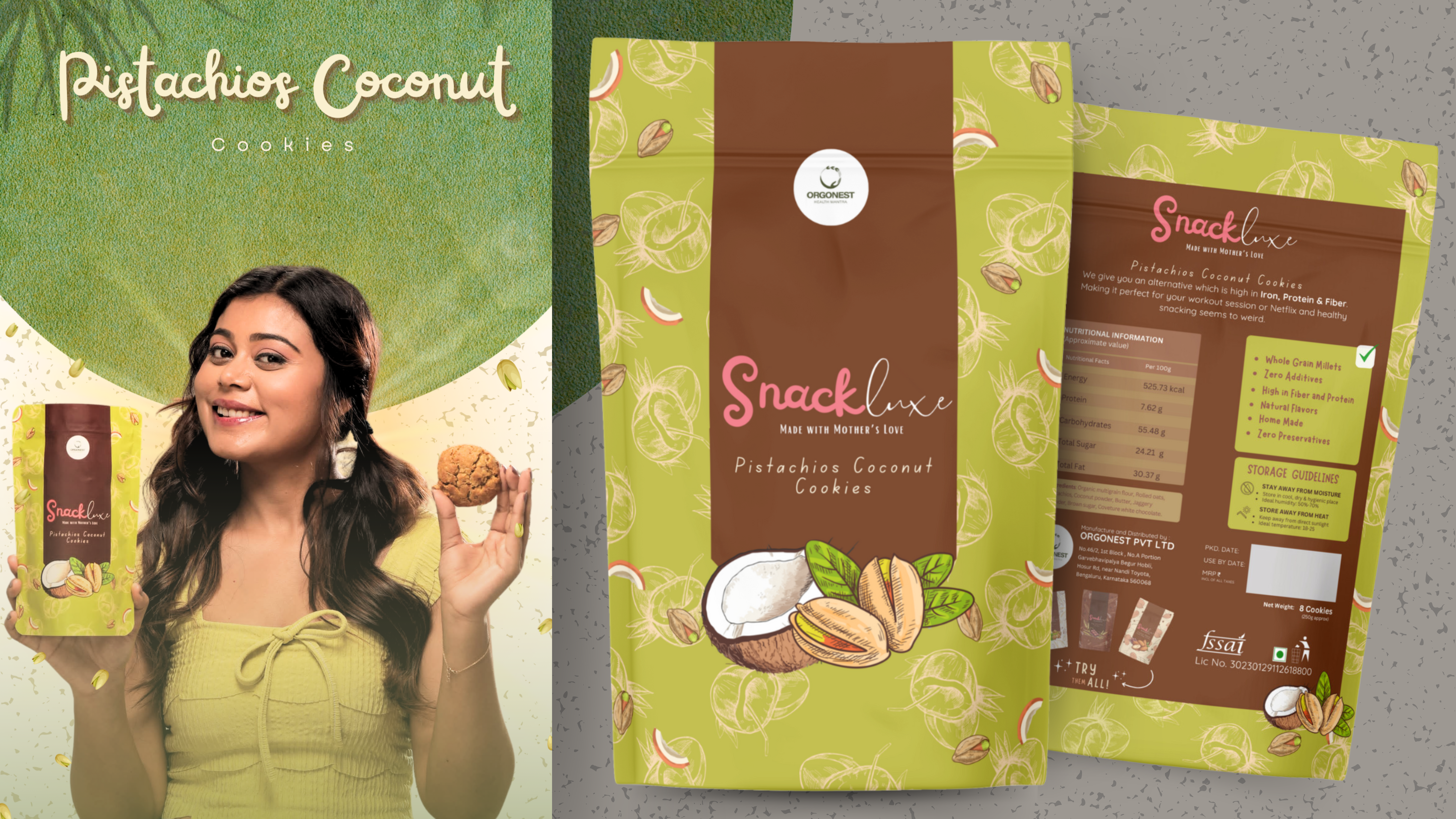
SnackLuxe branding: Pistachio Coconut cookie packaging and campaign artwork
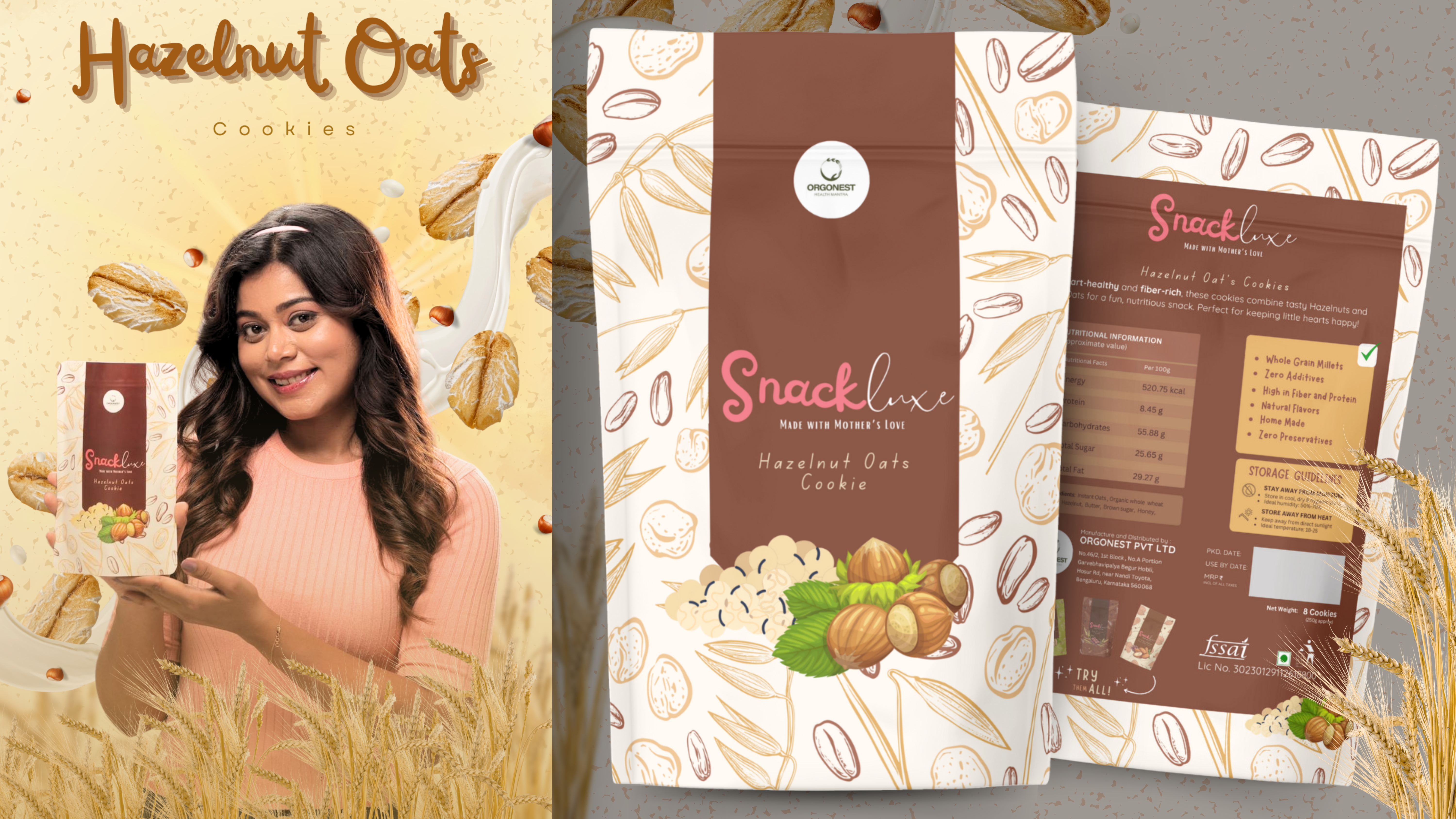
SnackLuxe branding: Hazelnut Oats cookie packaging and campaign artwork
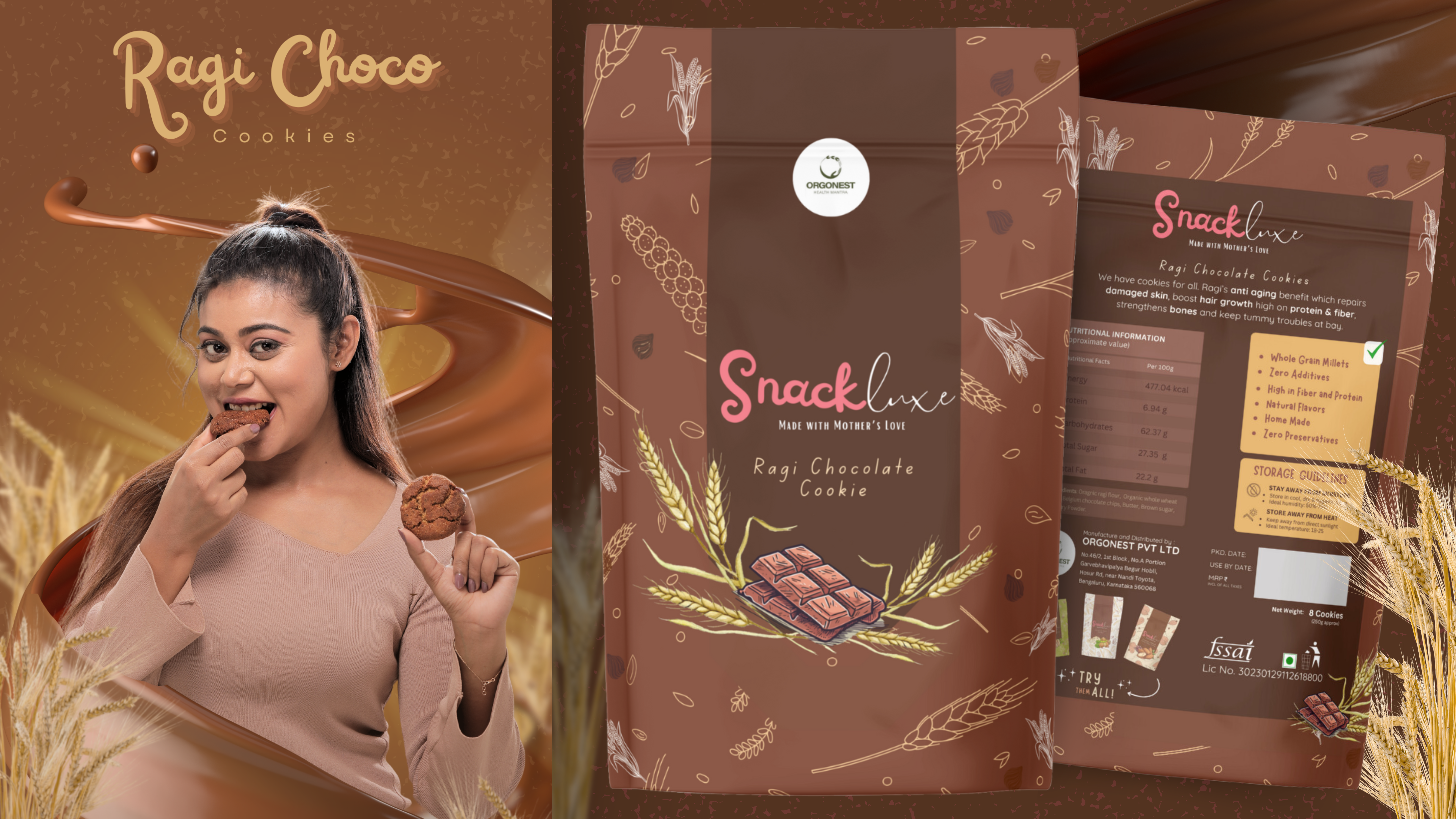
SnackLuxe branding: Ragi Choco cookie packaging and campaign artwork
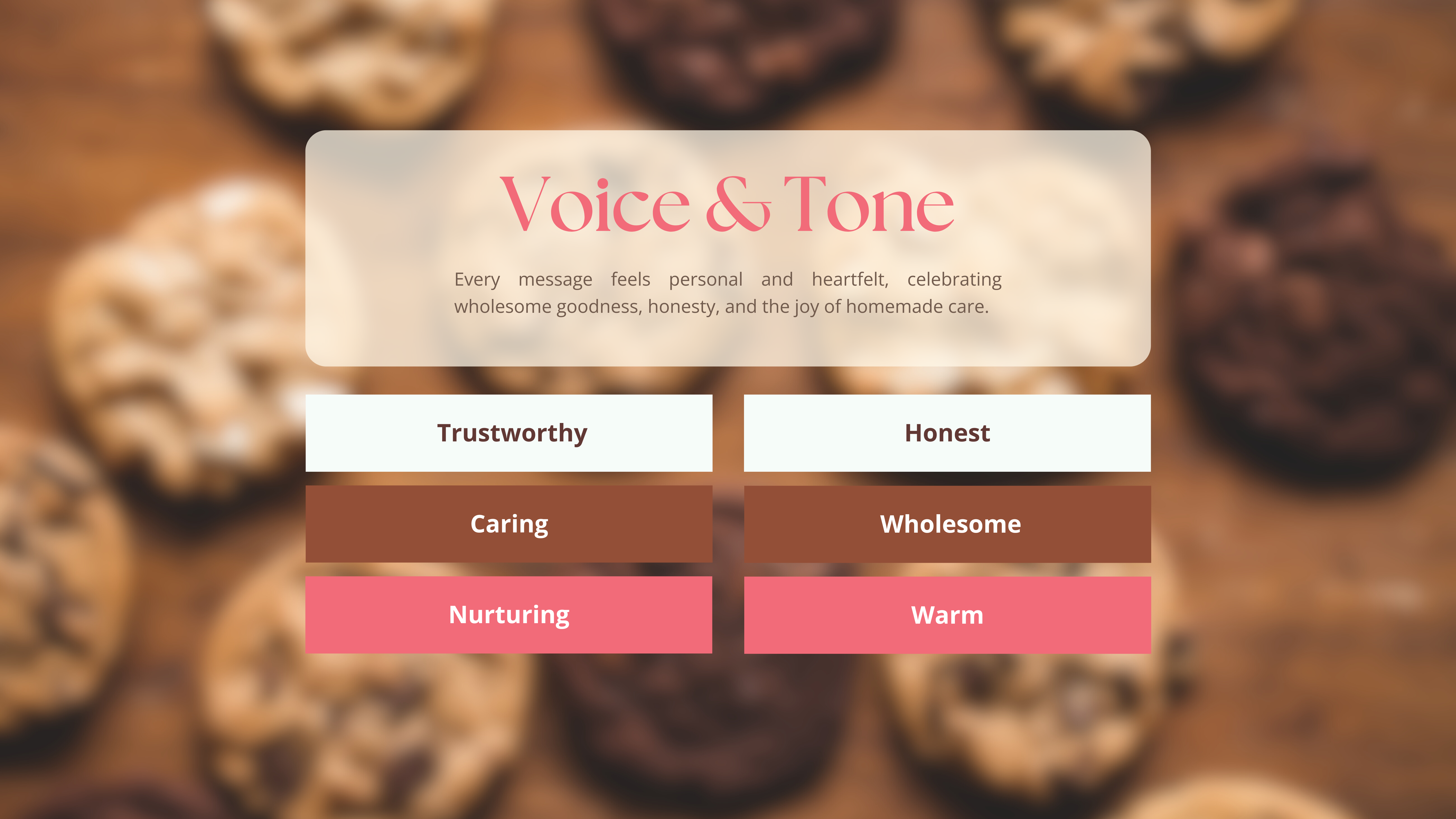
SnackLuxe branding: Voice and tone guide with trustworthy, honest and caring brand traits