

Chatoyance Interiors
When Chatoyance Interiors knocked on our door, they had a pretty straightforward ask: make their website as cool and contemporary as their interior designs. The old site? It had charm, sure, but it was kind of like that comfy, well-loved couch – great for its time, but not really cutting it anymore. They wanted something fresh, something that popped and made visitors say 'wow'. And, of course, it had to be user friendly with all the latest functionalities and UX. So, we rolled up our sleeves and got down to business, eager to mix our tech know-how with their creative flair to create a website that truly stands out.


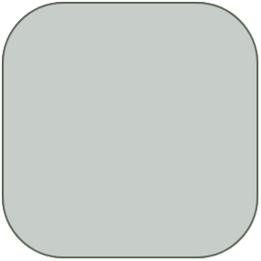
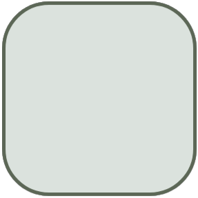
Selecting the colour palette for Chatoyance Interiors' website wasn't a piece of cake. From browsing through a range of options to finding the right tones that not only conveyed the simplicity of the brand but also breathed its modern approach. We shifted through countless shades, looking for just the right shade that would fit into the brand identity. The result? A carefully curated palette of greens and white that's not only visually stunning but also deeply resonant with the brand's identity.
Color Pallet
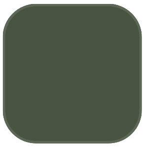


#485342
#C7CEC9
#5C6756
#DBE2DB
#FFFFFF
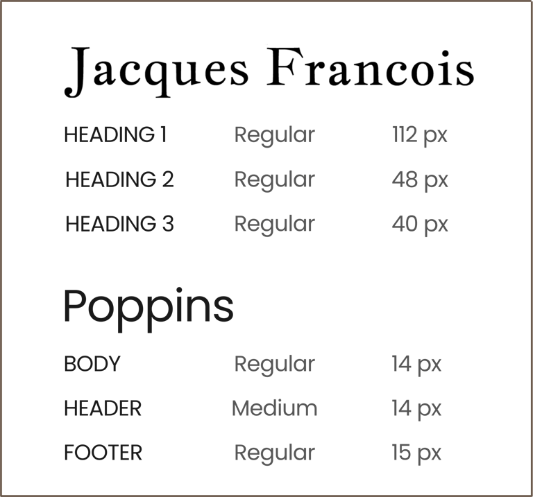
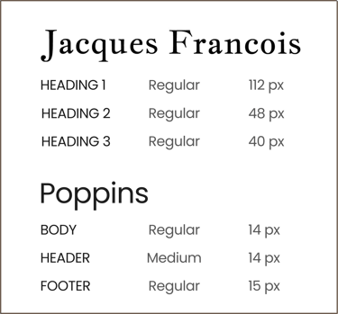
When it came to selecting the right fonts for the client, we needed something modern yet timeless. That's where Poppins came in – crisp, clean, and contemporary, perfect for a site that’s all about fresh ideas. It’s the kind of font that makes everything easy to read and looks sharp. But we wanted a touch of classic elegance too, so we added Jacques Francois to the mix. This font's like an old favourite book – it has a traditional feel that brings a sense of depth and history. Putting them together, we got a blend that’s just right for Chatoyance: forward-looking yet rooted in timeless style. It's more than just fonts – it's about capturing the essence of their brand in every letter.
Typography

Landing
Page


Service
Page


Portfolio
Page

Project Overview
The challenge was multidimensional. The existing website of Chatoyance Interiors was not just visually dated, but it also lacked the functionality and user experience that clients of high-end interior design services have come to expect. It was crucial to develop a website that not only showcased their portfolio in an appealing manner but also facilitated a seamless user journey.


Project Solution
We achieved this through a blend of aesthetic and functional design elements. The colour palette features calming greens and crisp whites, while the typography combines the contemporary Poppins with the classic Jacques Francois. The layout is streamlined for easy navigation, with an emphasis on showcasing the portfolio and services. The website is also fully optimised for performance across all devices, providing a seamless user experience.

Contacts
business@remonthub.com
Socials
Subscribe to our newsletter
Copyright © 2023 REMONT HUB - All Rights Reserved. | Disclaimer | Cookies Policy