Orpington Rasoi
Logo Design

We Put Dinner In The Logo.

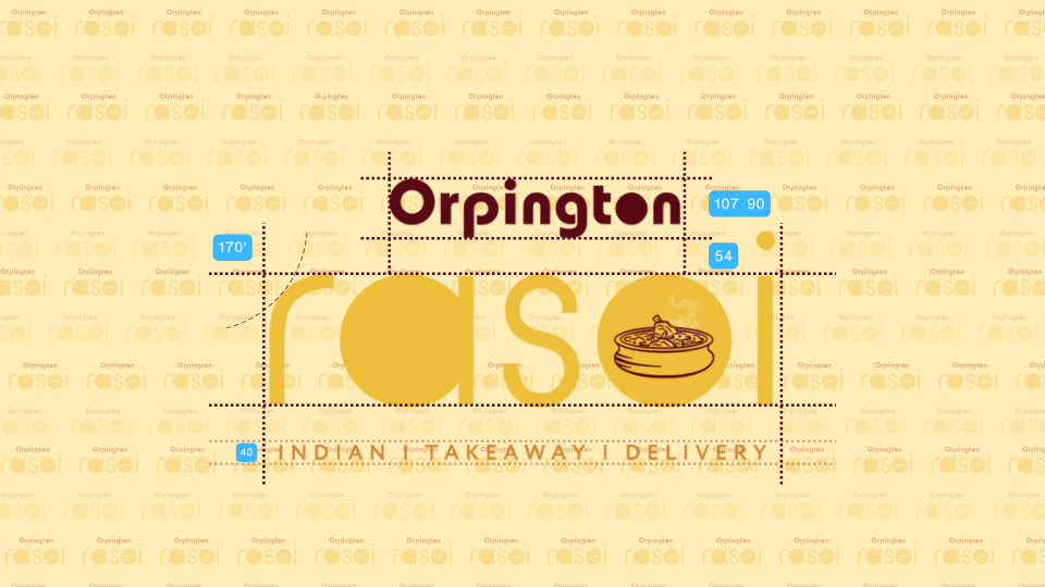
For Orpington Rasoi, a UK-based Indian takeaway, we tucked an illustrated bowl of steaming food into the “o” of Rasoi. A little detail that tells you what’s cooking before you’ve even opened the menu.

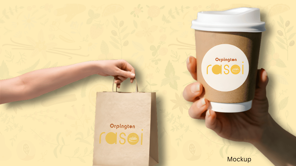
Rounded lettering, golden yellow and deep red give the logo a warm, familiar feel. We showed how it could carry through to takeaway bags and cup labels, right down to that little bowl.

The idea was to make the food easy to picture and the name easy to remember next time someone says, “Shall we order in?”
Orpington Rasoi: Burgundy and yellow restaurant logo with spacing measurements
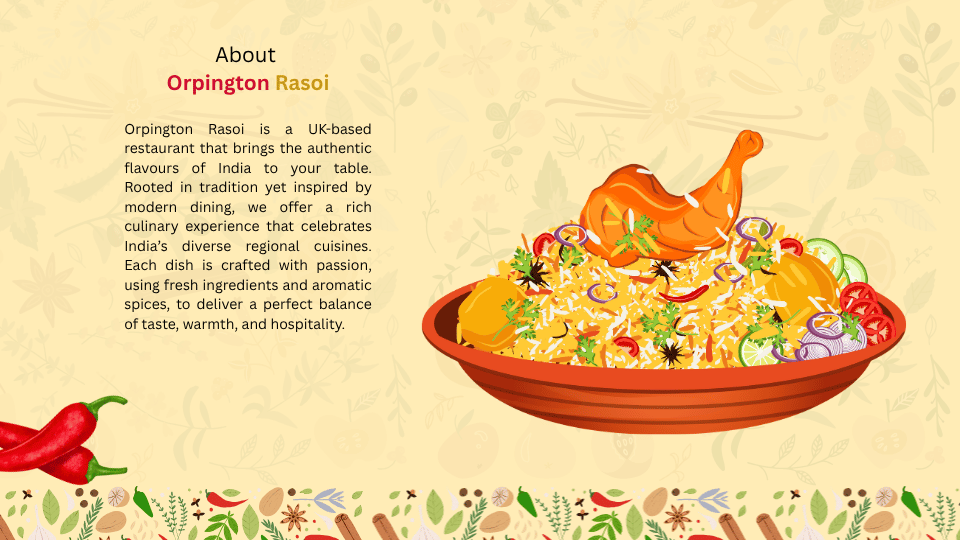
Orpington Rasoi: Brand introduction beside an illustrated rice dish
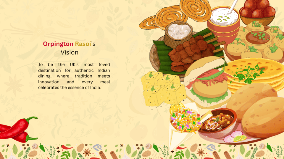
Orpington Rasoi: Brand vision beside an illustrated spread of Indian food
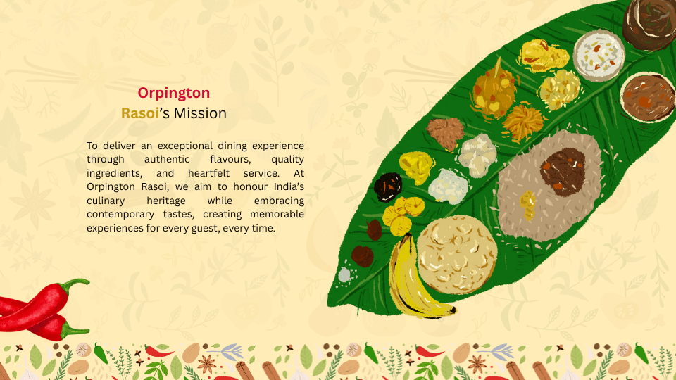
Orpington Rasoi: Brand mission beside an illustrated banana-leaf meal
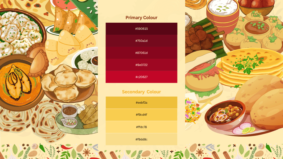
Orpington Rasoi: Burgundy and yellow colour palette beside Indian dishes
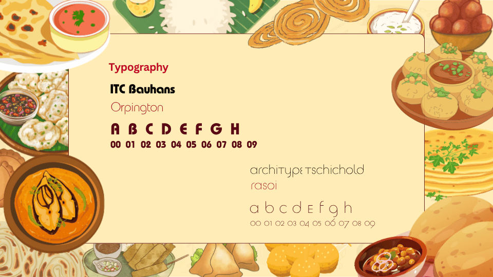
Orpington Rasoi: Typography specimens framed by illustrated food
Orpington Rasoi: Restaurant wordmark and bowl symbol on a yellow background
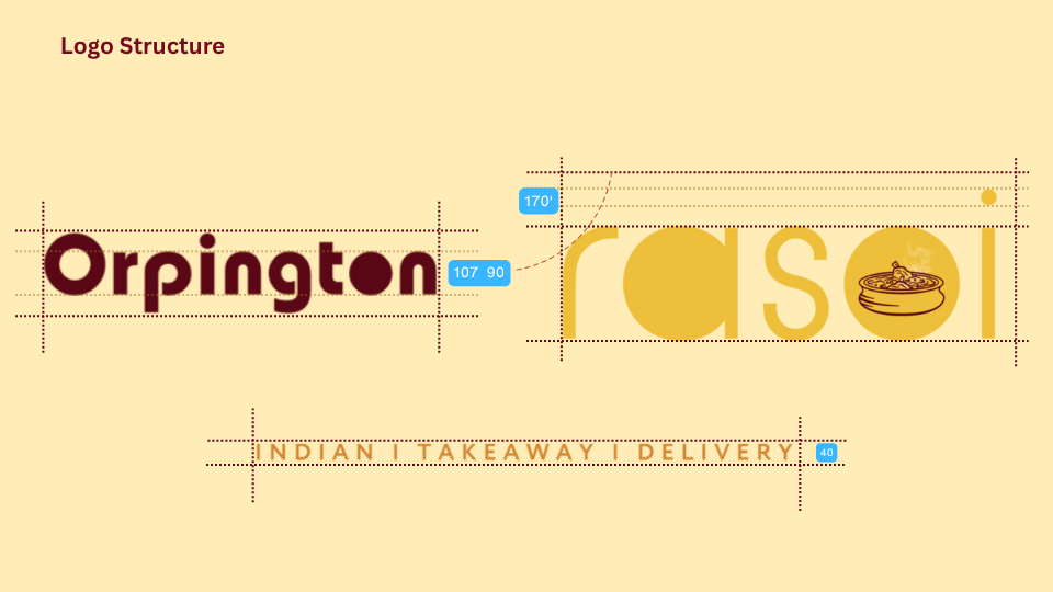
Orpington Rasoi: Wordmark construction lines and symbol proportions
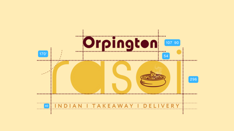
Orpington Rasoi: Complete logo measurements and Indian Takeaway Delivery tagline
Orpington Rasoi: Restaurant logo on a takeaway bag and coffee cup