Vahantech Engineering
Logo Design

Red First. The Rest Follows.

VahanTech teaches automotive and motorsport engineering through hands-on training. We made the company’s name the centre of the logo and gave each part a job.

Tall red letters make “VAHAN” the first thing you see. The slimmer grey “Tech” brings the volume down a notch, while “Engineering” gets its own line underneath. You get the name and what they do in one look.

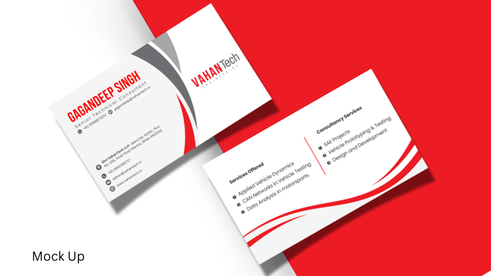
In the business card mockup, that red still catches your eye beside the contact details. The idea was to make VahanTech easy to remember after a quick introduction.
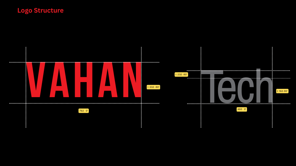
VahanTech Engineering: Red and grey wordmark with engineering tagline and spacing measurements
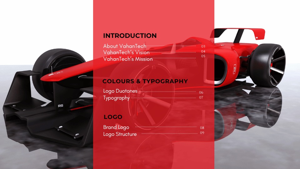
VahanTech Engineering: Brand presentation contents over a red racing car
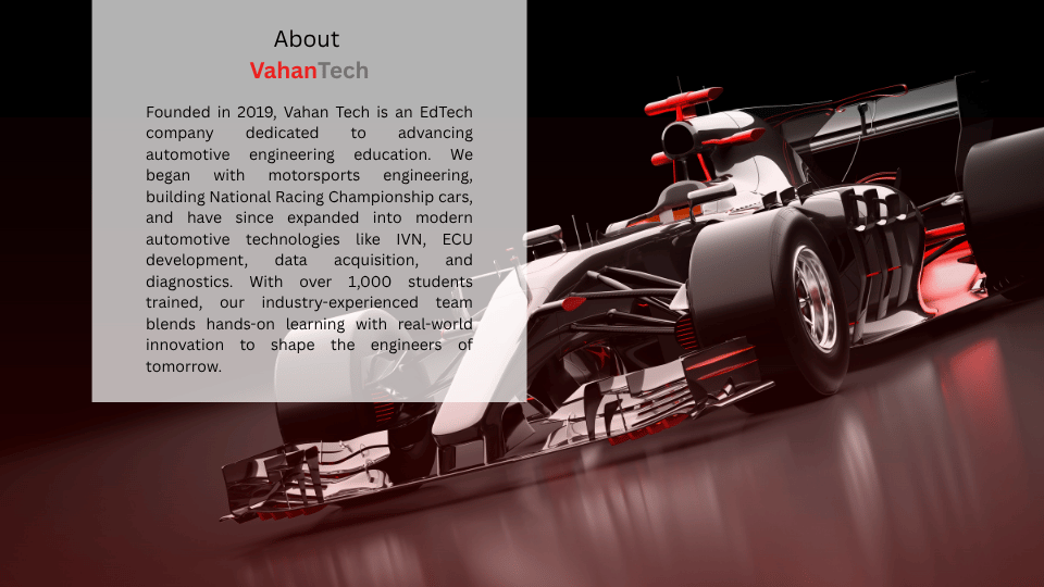
VahanTech Engineering: Company introduction beside a Formula-style racing car
VahanTech Engineering: Brand vision beside a racing car on a track
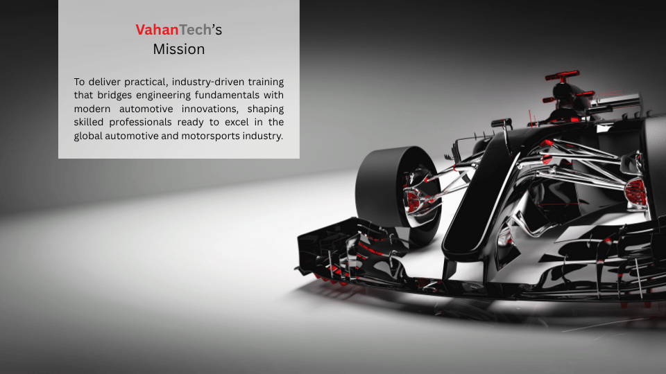
VahanTech Engineering: Brand mission beside a black and red racing car
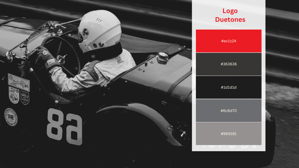
VahanTech Engineering: Red and grey colour palette beside a racing driver
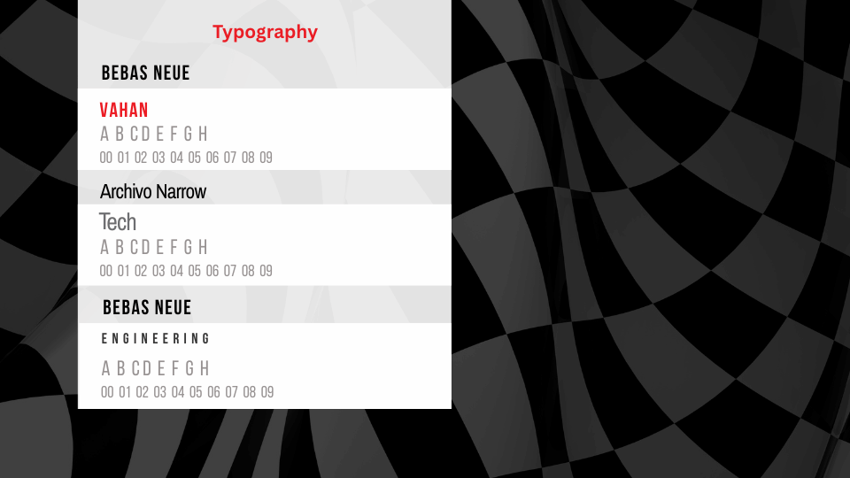
VahanTech Engineering: Typography specimens on a black and grey flag pattern
VahanTech Engineering: Red and grey wordmark on a black background
VahanTech Engineering: Lettering proportions and construction guides
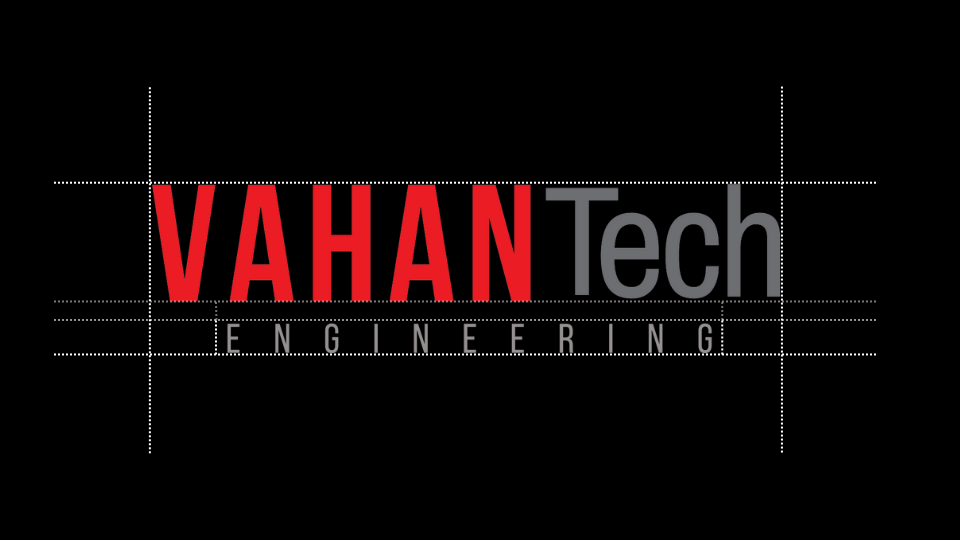
VahanTech Engineering: Wordmark alignment and engineering tagline spacing
VahanTech Engineering: Red and white business card mockups