Crunchzilla
We Gave Bihar’s Pantry A Shop Window.
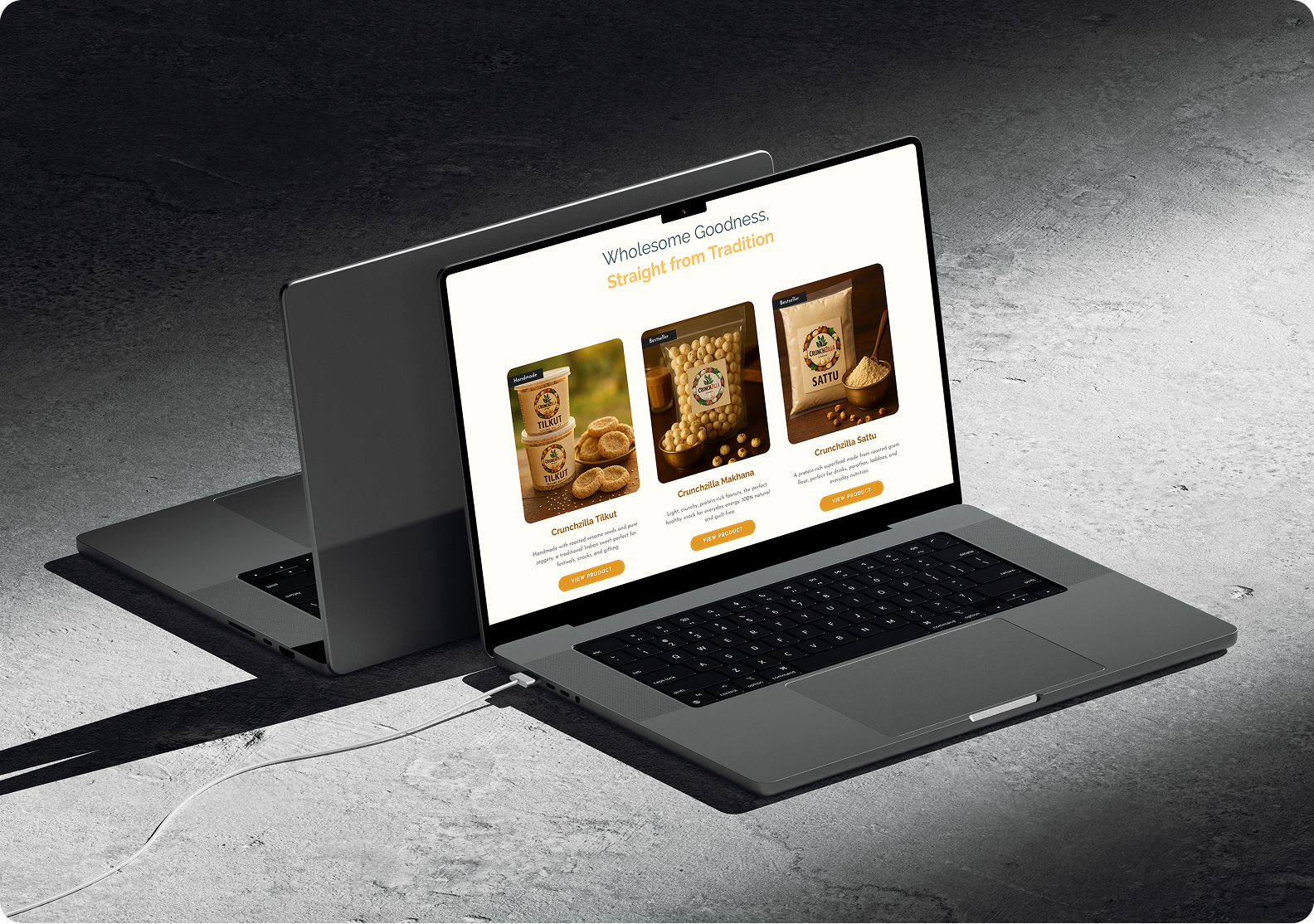
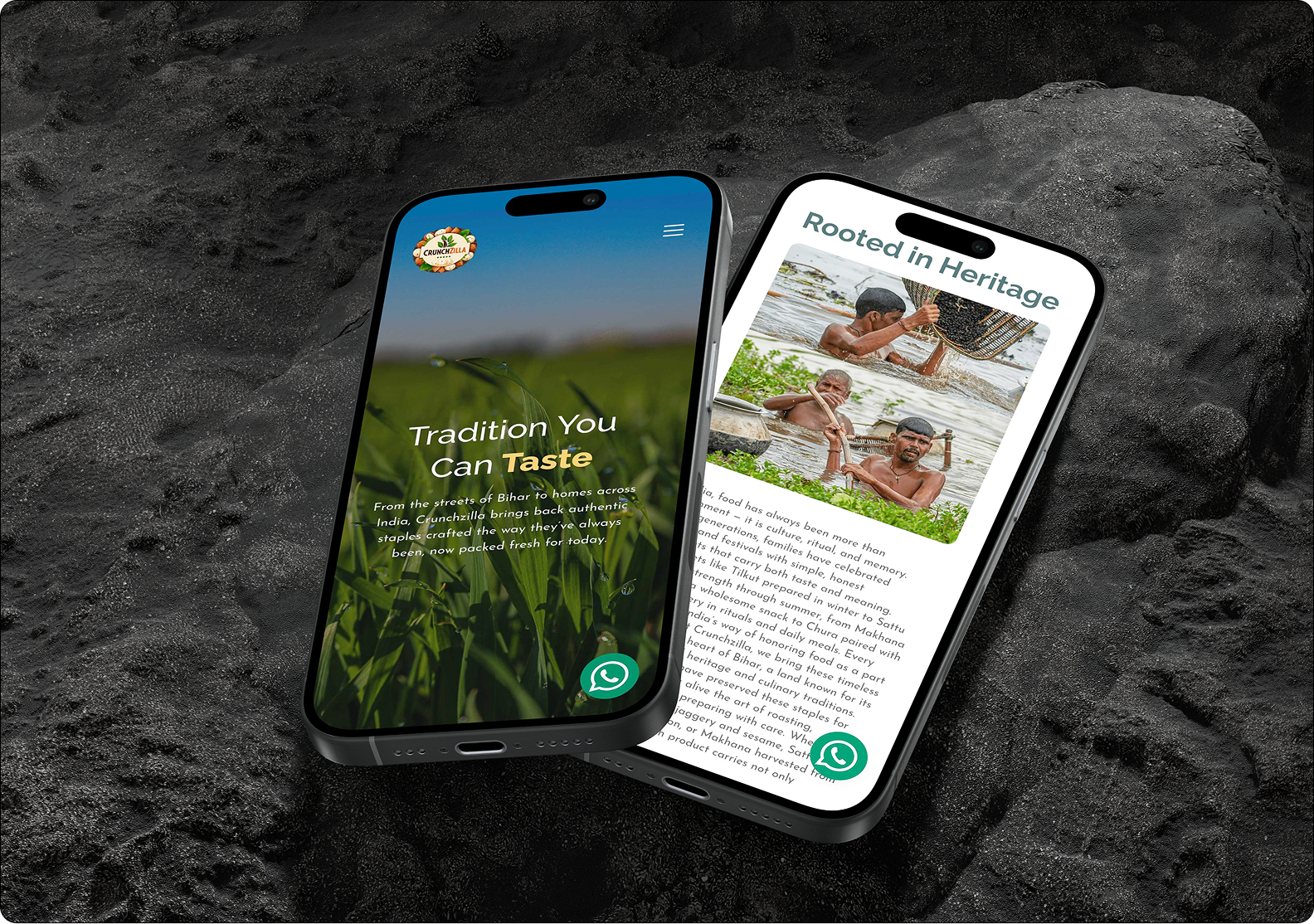
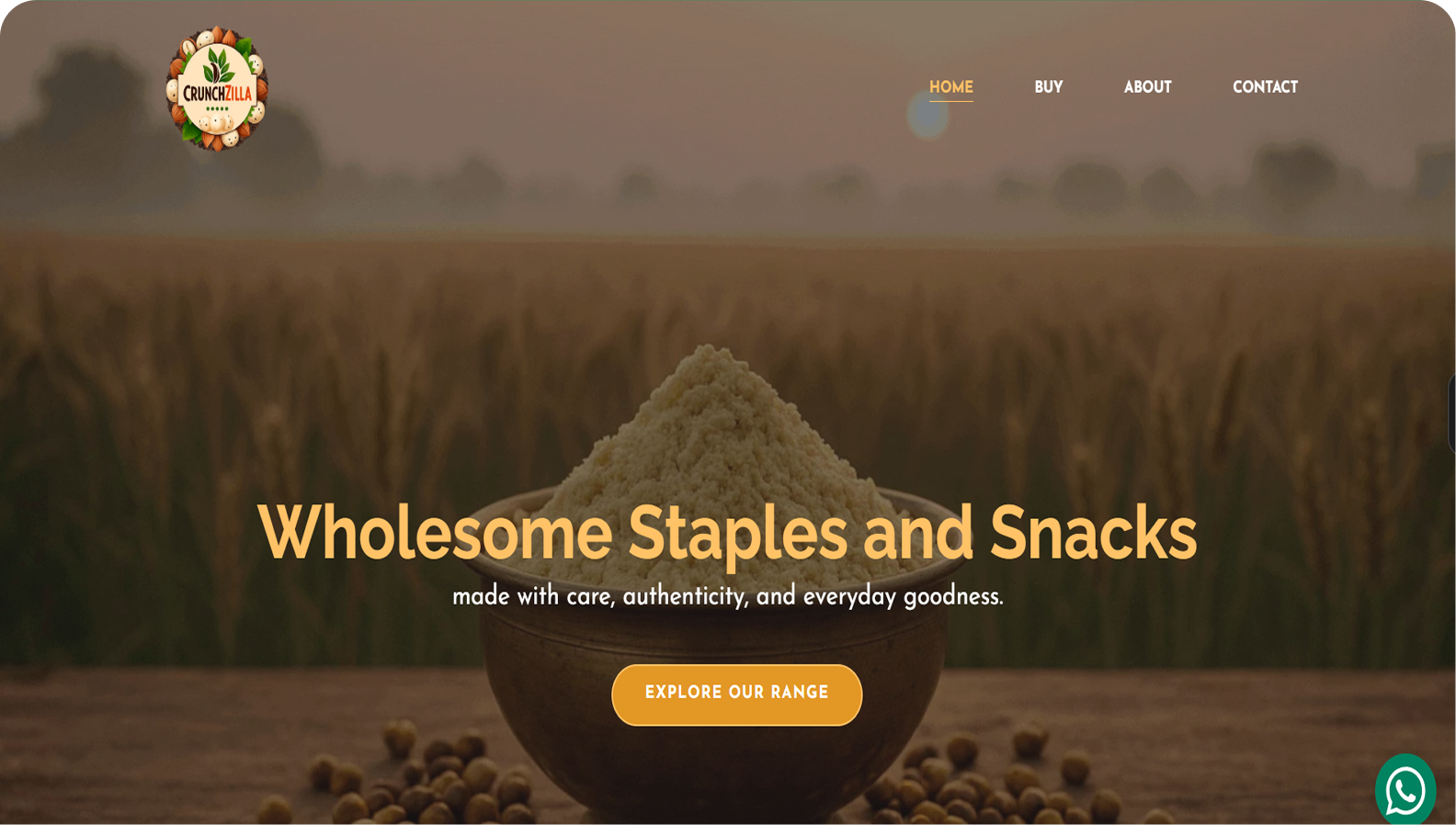
Crunchzilla brings familiar favourites like makhana, tilkut and sattu to shoppers online. We designed the site to make the range easy to browse and give people a feel for where it comes from.
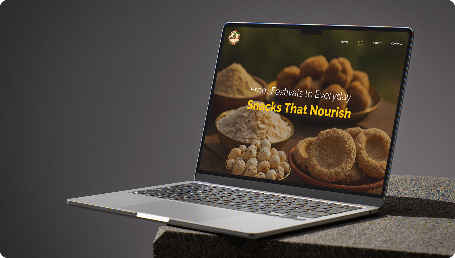
Golden yellows and close-up food photography put the products front and centre. Simple product cards help shoppers get straight to what caught their eye. For anyone curious about the story, photos of makhana harvesting bring a bit of Bihar into the browse.
Once something looks good enough to try, finding it should be the easy part.
Typography
Crunchzilla website uses a complementary type pairing of Raleway and DM Sans to balance personality with readability. Raleway is applied to headings for its bold, geometric character, establishing strong visual hierarchy across display and section titles. DM Sans is used for body text and secondary headings, chosen for its clean, humanist forms that enhance legibility at smaller sizes. Clear size scaling and consistent weight usage ensure a structured, modern, and user-friendly typographic system.
Raleway
DM Sans
Color Palette
This palette is built around warm, energetic hues of amber and yellow, balanced with clean white for clarity. The deeper golden tones establish warmth and brand personality, while lighter yellows and soft peach shades add approachability and visual flow. White is used to create contrast and breathing space, ensuring the interface remains bright, engaging, and easy to navigate.