Snackluxe
Logo Design
Signed, Sealed, SnackLuxe.
SnackLuxe grew out of Ranu’s love of home baking. We wanted the logo to feel as personal as a note tucked into a bag of cookies.
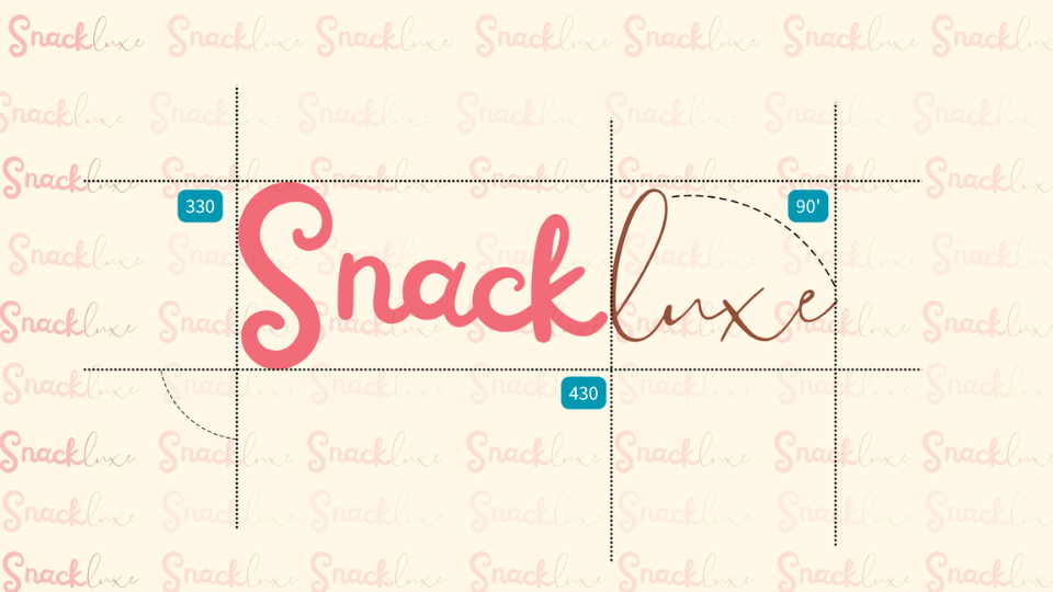
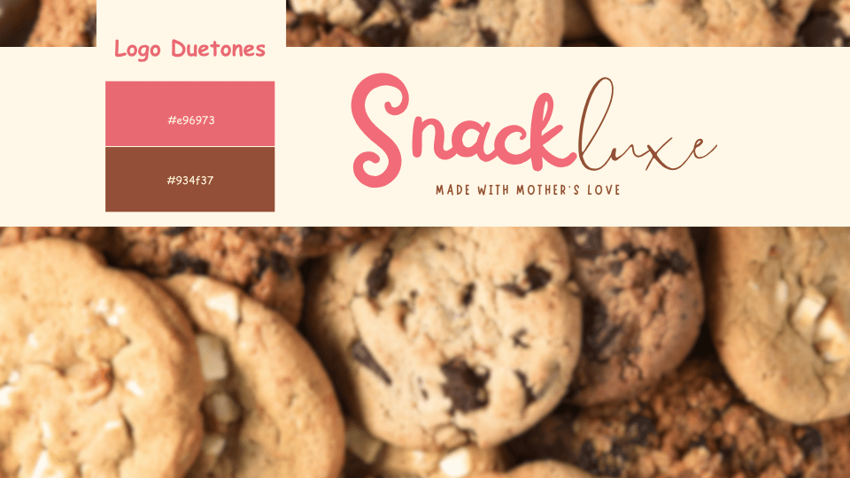
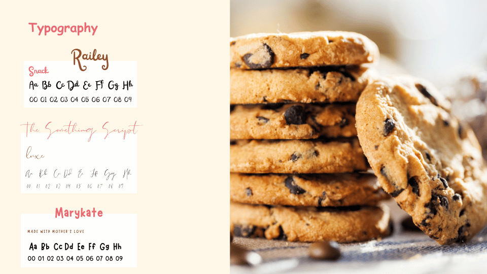
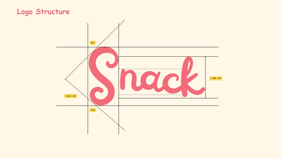
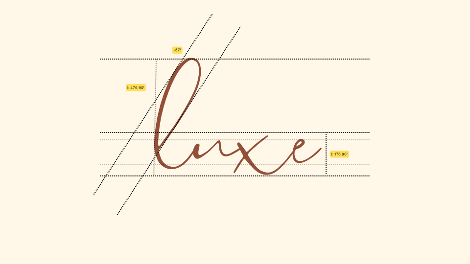
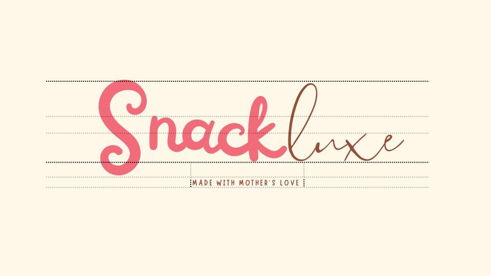
We gave “Snack” a chunky pink script with a big looping “S”, then wrote “luxe” in a finer cocoa brown script. Both have a handwritten feel, with a little change of pace halfway through the name.
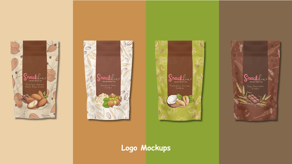
The illustrations change with each flavour in the pack mockups. That looping pink “S” gives shoppers something familiar to look for when they come back for their favourite.