Koorm
A Lookbook You Can Actually Shop.
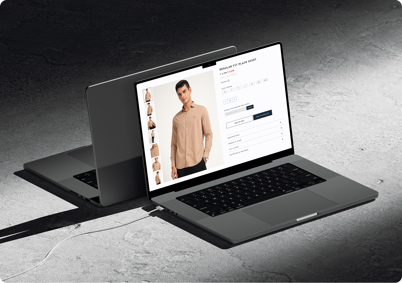
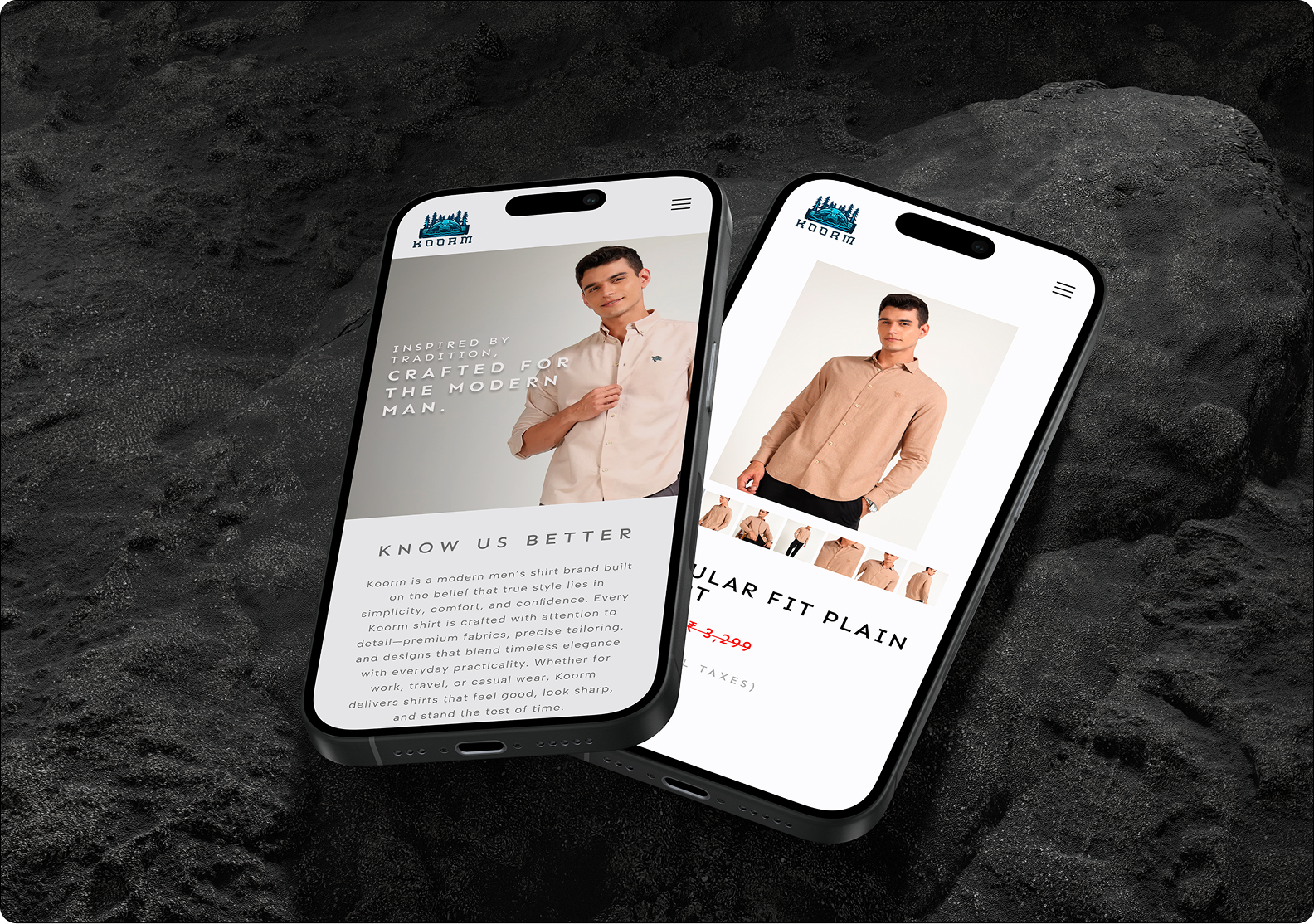
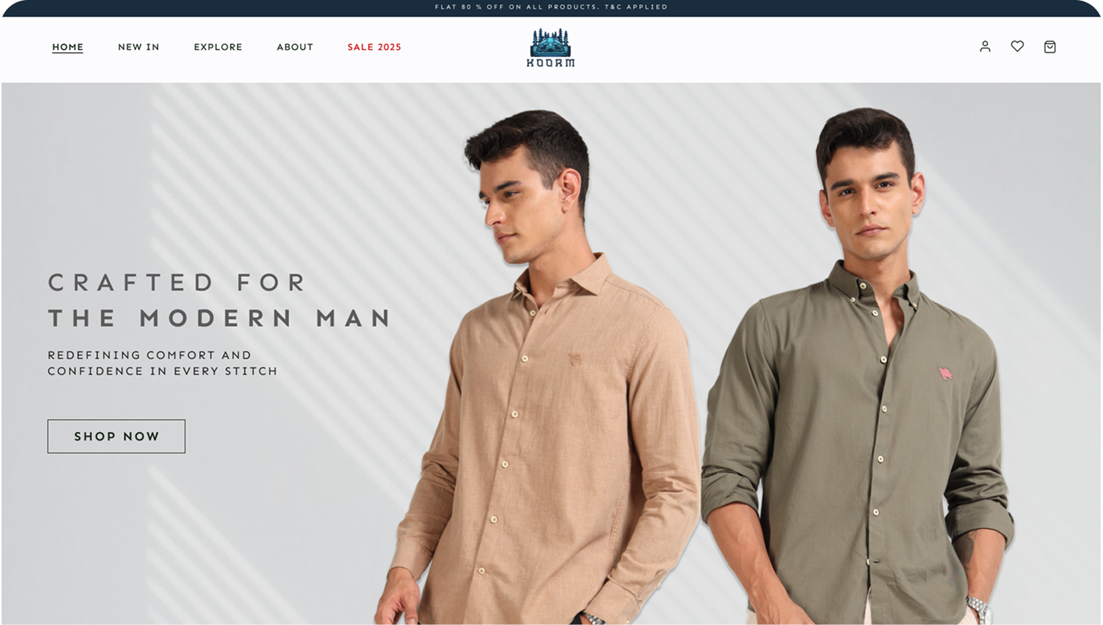
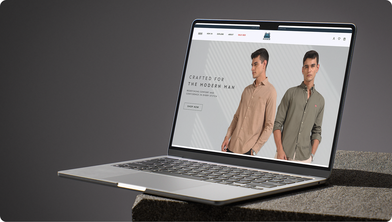
We designed Koorm’s online store to give its everyday shirts a proper entrance. Full-width photography, cool greys and deep navy set the scene. The clothes get the best spot on the page.
Find a shirt you like and the design gets down to business. See it from a few angles, check the size guide, look up the fabric and see when it could arrive. On mobile, the photos still get plenty of room.
We wanted shoppers to go from “nice shirt” to “I know which one I’m getting” in the same visit.
Typography
The typographic system is designed to communicate strength and modernity. Using Sen in uppercase with expanded letter spacing creates a confident,editorial feel. A clear distinction between medium and bold weights reinforces hierarchy, while consistent sizing, cap-height trimming, and balanced line height ensure clarity and cohesion across the design.
Sen
Color Palette
The color palette is rooted in neutral greys and deep blue tones too createa refined, modern aesthetic. Soft whites and balanced greys establish clarity andbreathing room, while muted blue-grey adds depth withoutoverpowering the layout. The deep navy accent introduces contrast andfocus, grounding the design and reinforcing a confident,contemporary visual identity.